| Author | Thread |
|
|
12/10/2003 07:10:00 PM |
Greetings from the Critique CLub
Great colours.
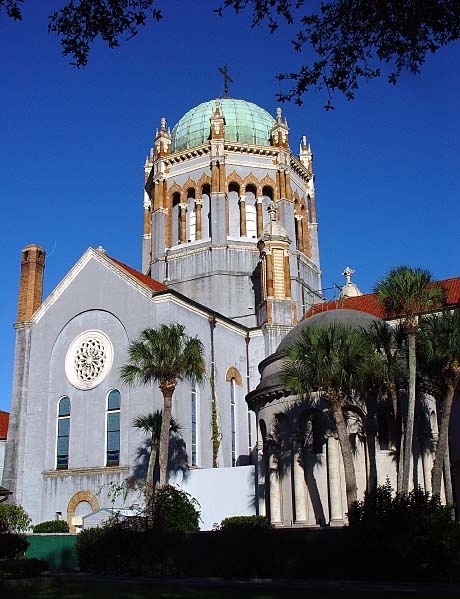
Not sure why you have that pixelation showing, may just be a problem of resizing or resolution, and what is the line coming from the chimney?
Those things jump right out.
I would suggest cropping the bottom of the image up to the top of the green wall. The dark foreground isn't helping.
The composition is a bit too regular, centreing the main dome like that isn't making for a dynamic presentation.
Possibly another angle, shooting more from the right to present the two domes? But that may not be possible, I don't know what there is around this building. Looks like maybe the trees would have been in the way.
It is a wonderful interesting building that has many possibilities.
I hope this helps, and of course, this just my opinion.
JC |
|
 Photographer found comment helpful. Photographer found comment helpful. |
Comments Made During the Challenge  |
|
|
12/01/2003 02:58:30 AM |
bad points slightly pixelated. and a bit wonkey. Quite a dull subject for me.
Good points nice colors and good sky exposure.
Overall Score 4
|
|
|
|
11/30/2003 02:44:53 PM |
| Good colors. There is a bit of .jpg distortion that bother me, you can best see it where the sky meets the building and trees. Like the trees at the top, gives a bit of depth to the shot. |
|
| Photographer found comment helpful. |
|
|
11/30/2003 04:15:18 AM |
| Nicely framed by trees below and trees above. Bright sunlit colors. I'd crop some more on the bottom the shadowy line of the path (or wall?0 is hard to figure out and just destracts from the picture. Bit over sharpened? Would make a nice postcard. |
|
| Photographer found comment helpful. |
|
|
11/30/2003 04:11:02 AM |
| I like this image. It is well composed and has some nice colors and good clarity, though I'm not sure what I'm supposed to be feeling due to you enigmatic title. Still, nice, clear work. |
|
| Photographer found comment helpful. |
|
|
11/29/2003 05:19:44 AM |
| great old church.....look at the Palmtrees! |
|
| Photographer found comment helpful. |
|
|
11/28/2003 09:29:46 PM |
| Nice composition. Building is overexposed a touch. Appears the metering methodology needed to be changed to center weighted or the entire view. |
|
| Photographer found comment helpful. |
|
|
11/28/2003 07:51:25 PM |
| This is really pretty. Nice shot, ....a postcard. The colors are good as is the focus. |
|
| Photographer found comment helpful. |
|
|
11/28/2003 07:47:42 PM |
|
| Photographer found comment helpful. |
Home -
Challenges -
Community -
League -
Photos -
Cameras -
Lenses -
Learn -
Help -
Terms of Use -
Privacy -
Top ^
DPChallenge, and website content and design, Copyright © 2001-2025 Challenging Technologies, LLC.
All digital photo copyrights belong to the photographers and may not be used without permission.
Current Server Time: 04/07/2025 01:04:13 PM EDT.