| Author | Thread |
|
|
03/26/2007 08:41:06 AM |
greetings from the critique club!
well, let's see, you got a 6 on this image which is over a point higher than I usually get, so I'm not one to tell you how to score better. I will say, however, that this does eschew certain DPC principles and scored high anyway, which is an accomplishment to be proud of. I think to ribbon you need a very tight "unity of purpose." In other words, the photo must have an obvious single goal or point and everything about that photo must contribute to it. You have the goal here, but not everything contributes to it. There are some internal contradictions to this photo that confuse the poor DPC voter. Let's discuss:
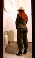
The dress here, as well as clearly indicating gender roles, also clearly indicates a formal setting (and the cool-toned b/w makes it seem old-fashioned formal, in other words, even more formal, distant). But you are in front of a grungy brick wall (and the single light source casting strong shadows contributes to that grungy feeling). You are also in front of a corner. This has wonderful symbolic implications... turning a corner, gone round the bend, in other words, on two planes of existence at once. But there is no literal reason why someone in formal dress would be standing in front of a grungy corner (actually some kinky ideas are coming to mind, but don't expect that sort of perversity from the DPC voter). And here's what happens when you present something that makes sense symbolically but not literally: you force the viewer to look symbolically.
This makes DPC voter angry. DPC voter works hard to create the illusion of crystal clear reality with every photo, and thinks you are being lazy. This is because DPC voter doesn't think symbolically except on the most primitive level (beer = good time! pretty lady = good time!). I think the reason you did as well as you did is because you met the challenge in a unique but still direct way, and you made a convincing illusion. This is sort of why I did NOT vote you higher than 6. I felt like this picture was just saying Ta-Da! I met the challenge! and nothing more. Because it was well done, I gave it a 6. To get a 7 or higher it has to stand on its own and appeal to me.
Just to say more about why I didn't score it higher, my reasons are sort of similar to "DPC voter" above. The thirties-theme and grunge-theme didn't seem to love or hate each other. I didn't sense a chemistry between them. The bowed legs seem awkward, done only to facilitate the illusion. If I looked at it longer, I might have voted higher though. I barely noticed that you were in front of a corner, and I like that symbolically as I mentioned above, and I like how the awkward angles of your legs interact with the odd angles of chimney and wall. It is a dynamic and interesting composition, though I still want more thematic interest. |
|
 Photographer found comment helpful. Photographer found comment helpful. |
Comments Made During the Challenge  |
|
|
03/19/2007 08:38:24 PM |
|
| Photographer found comment helpful. |
|
|
03/19/2007 11:49:34 AM |
|
| Photographer found comment helpful. |
|
|
03/17/2007 10:24:02 PM |
| Very interesting photo. Could have been slightly straighter! |
|
| Photographer found comment helpful. |
|
|
03/17/2007 05:32:26 PM |
| Talk about your split personalities ... I think this is carrying the principle to extremes -- perhaps your alternate title could be The Strange Case of Dr. Jekyll and Ms. Hyde : ) |
|
| Photographer found comment helpful. |
|
|
03/15/2007 10:05:24 PM |
|
| Photographer found comment helpful. |
|
|
03/14/2007 08:50:57 PM |
|
| Photographer found comment helpful. |
|
|
03/14/2007 06:01:20 PM |
|
| Photographer found comment helpful. |
|
|
03/14/2007 05:16:51 PM |
|
| Photographer found comment helpful. |
|
|
03/14/2007 02:56:22 PM |
| not really my style of picture that I care for but the idea is very creative so I gave ya a good score. |
|
| Photographer found comment helpful. |
|
|
03/14/2007 12:55:12 PM |
|
| Photographer found comment helpful. |
|
|
03/14/2007 11:42:42 AM |
| hhmmm:) I tried to imagine how the hole figure lookd like when you took this, hehe:)) |
|
| Photographer found comment helpful. |
|
|
03/14/2007 08:25:50 AM |
| nice comp., good subject matter, like the pose. the lighting is a little off though, and so is the focus. |
|
| Photographer found comment helpful. |
|
|
03/14/2007 07:49:30 AM |
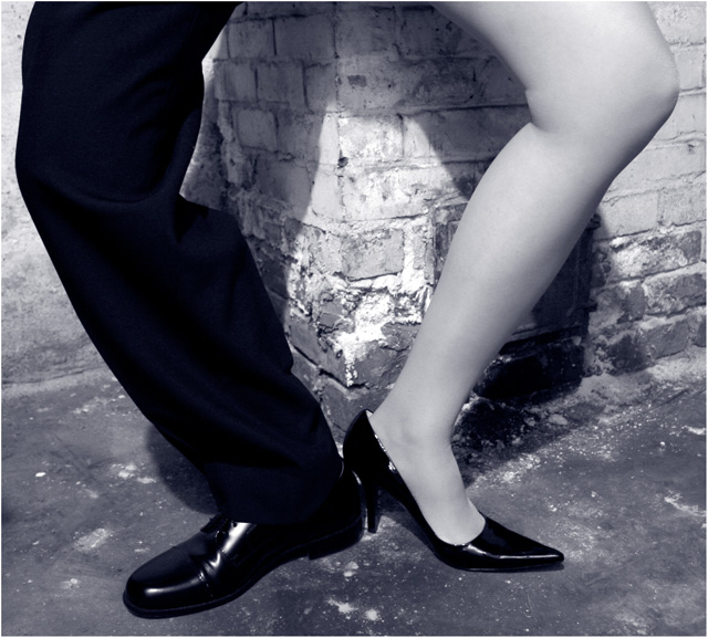
| if they are legs of the same person- you have captured an amazing image- if not its not fair. i am giving this a 8 thinking its one person here |
|
| Photographer found comment helpful. |
|
|
03/14/2007 06:22:16 AM |
| i like the idea but not sure why you chose right in front of the brcik corner. my eye keeps going there 7 |
|
| Photographer found comment helpful. |
|
|
03/14/2007 04:46:45 AM |
| really like the idea, and shooting it on the corner of a building adds a nice dimension to it. |
|
| Photographer found comment helpful. |
|
|
03/14/2007 01:52:50 AM |
| Oooh...this looks painful! |
|
| Photographer found comment helpful. |
|
|
03/14/2007 01:29:50 AM |
| I love the idea. Good thinking. Would have been a much much better picture if you would have succeeded in bringing in more symmetry |
|
| Photographer found comment helpful. |
|
|
03/13/2007 10:29:38 PM |
|
| Photographer found comment helpful. |
|
|
03/13/2007 10:25:01 PM |
| This is very nicely carried out! |
|
| Photographer found comment helpful. |
|
|
03/13/2007 09:06:43 PM |
|
| Photographer found comment helpful. |
|
|
03/13/2007 08:15:11 PM |
|
| Photographer found comment helpful. |
Home -
Challenges -
Community -
League -
Photos -
Cameras -
Lenses -
Learn -
Help -
Terms of Use -
Privacy -
Top ^
DPChallenge, and website content and design, Copyright © 2001-2025 Challenging Technologies, LLC.
All digital photo copyrights belong to the photographers and may not be used without permission.
Current Server Time: 04/07/2025 02:18:13 AM EDT.