| Author | Thread |
|
|
03/21/2007 01:58:54 PM |
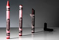
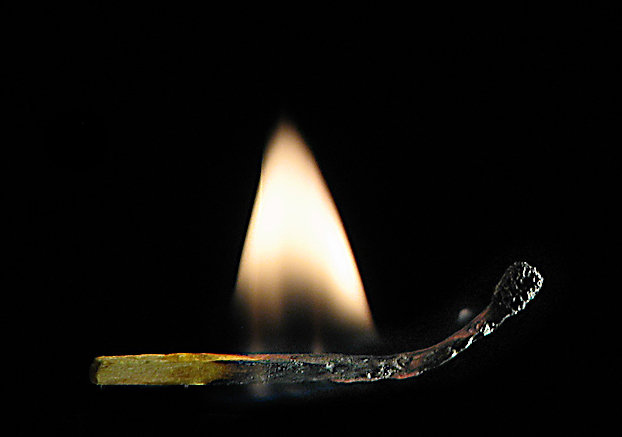
Most of the high scoring match shots have pretty vivid colors(at least as I recall). Yours seems more muted. I like the detail on the burned portion of the match, but not crazy about its placement in the frame. Maybe the lighting is a little harsh on the burned part of the match but not a big negative IMHO. A slight tilt of the match might have been a better choice.
I'm sure some of the low votes are the result of literalists not seeing the clock in the upper LH corner ;)
mark |
|
 Photographer found comment helpful. Photographer found comment helpful. |
|
|
03/19/2007 06:38:14 PM |
| I especially like the light on the tip of of the match. Very well done. |
|
| Photographer found comment helpful. |
|
|
03/19/2007 03:23:27 AM |
| Cool shot Jeffrey. I think it would be neat with a little saturation boost. JMO |
|
| Photographer found comment helpful. |
Comments Made During the Challenge  |
|
|
03/14/2007 07:53:34 AM |
| Interesting idea. I think if you took it at a different angle it would make the picture better. |
|
| Photographer found comment helpful. |
|
|
03/14/2007 02:25:41 AM |
|
| Photographer found comment helpful. |
|
|
03/12/2007 07:15:30 AM |
| I'd burn my house down if I tried this. Very cool shot. I like how the match curls up on the end. |
|
| Photographer found comment helpful. |
|
|
03/12/2007 03:50:38 AM |
| Excellently done! Perfectly focussed, well set up. Be proud of this. |
|
| Photographer found comment helpful. |
|
|
03/12/2007 03:46:44 AM |
|
| Photographer found comment helpful. |
Home -
Challenges -
Community -
League -
Photos -
Cameras -
Lenses -
Learn -
Help -
Terms of Use -
Privacy -
Top ^
DPChallenge, and website content and design, Copyright © 2001-2025 Challenging Technologies, LLC.
All digital photo copyrights belong to the photographers and may not be used without permission.
Current Server Time: 04/08/2025 08:00:13 AM EDT.