| Author | Thread |
|
|
03/18/2007 06:08:27 AM |
Hi, Greetings from the Critique Club:
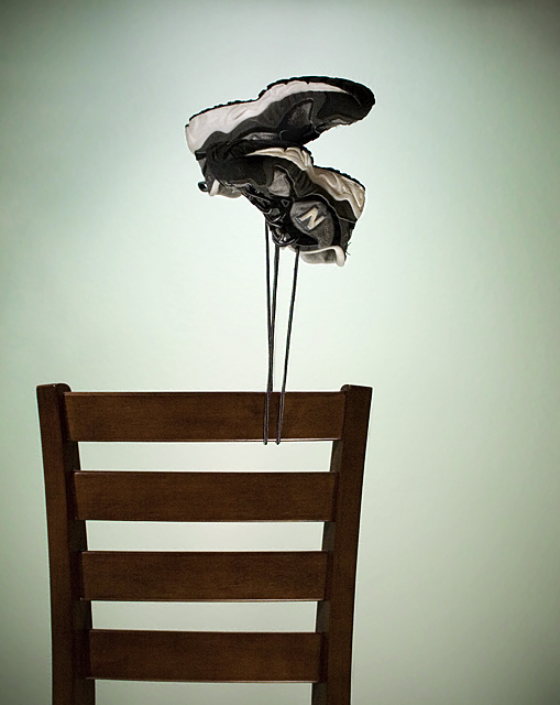
Composition:This is great. I love the idea and the execution of the image. I like how you have put it off centre...but am getting lost in the vacant space on the right. Maybe if you could have put a bookshelf or something there upside down...so when you flipped it, it would have looked even more convincing and also fill up the space.
Technical: You have the settings, lighting and focus right...but I would like to see some Shadow/Highlight used to bring out some of the shoe details and show some richness in the wood. I feel the green is very off putting and would like to see that changed to a different hue.
Overall:I think this is a fantastic effort....and with a little more detail concentration you can really pull off a winner with it next time. |
|
 Photographer found comment helpful. Photographer found comment helpful. |
|
|
03/12/2007 01:20:10 AM |
| I Loved this one! You got ripped man |
|
| Photographer found comment helpful. |
Comments Made During the Challenge  |
|
|
03/09/2007 06:02:00 AM |
| Well done... good imagination... |
|
| Photographer found comment helpful. |
|
|
03/09/2007 03:23:29 AM |
| Cool play on the name of the shoes. Great image. |
|
| Photographer found comment helpful. |
|
|
03/08/2007 09:56:30 PM |
| points for clever wordplay, but otherwise boring photo |
|
| Photographer found comment helpful. |
|
|
03/08/2007 05:08:03 PM |
| New Balance - The super light shoe - Very creative - good luck in this challenge |
|
| Photographer found comment helpful. |
|
|
03/08/2007 09:32:23 AM |
|
| Photographer found comment helpful. |
|
|
03/07/2007 05:24:18 PM |
| wow!!! you better take this down before newbalance themselves steal this idea from you...AMAZING!!!!!!! maybe even propose this idea to them...royalties possibility.. |
|
| Photographer found comment helpful. |
|
|
03/07/2007 08:47:26 AM |
| Creative, inventive, nice lighting, 10. |
|
| Photographer found comment helpful. |
|
|
03/06/2007 11:13:58 PM |
| Not a nike air is it :) ( am I the 10th person to make that lame joke?) Nice Idea, I like the vengetting I think you could use more lighting on the chair as it look like you have lost a bit of detail there. Good Luck |
|
| Photographer found comment helpful. |
|
|
03/06/2007 11:05:17 PM |
|
| Photographer found comment helpful. |
|
|
03/05/2007 07:38:36 PM |
| oddly enough, i saw another of this shot from the illusion challenge way back when, just today. like it :) |
|
| Photographer found comment helpful. |
|
|
03/05/2007 04:43:57 PM |
| Very creative well done on making an average pic look much better. |
|
| Photographer found comment helpful. |
|
|
03/05/2007 01:09:35 PM |
|
| Photographer found comment helpful. |
|
|
03/05/2007 08:40:58 AM |
| l'homage?, tribute?, redo?, or just a copy? ... I don't see any reason this won't do well again but the idea is half of it ... isn't it? |
|
| Photographer found comment helpful. |
|
|
03/05/2007 12:43:28 AM |
| clever...well executed and well lit |
|
| Photographer found comment helpful. |
Home -
Challenges -
Community -
League -
Photos -
Cameras -
Lenses -
Learn -
Help -
Terms of Use -
Privacy -
Top ^
DPChallenge, and website content and design, Copyright © 2001-2026 Challenging Technologies, LLC.
All digital photo copyrights belong to the photographers and may not be used without permission.
Current Server Time: 02/01/2026 11:01:35 AM EST.