| Author | Thread |
Comments Made During the Challenge  |
|
|
08/25/2002 07:30:00 PM |
| Neat photo, but maybe try turning down the contrast just a bit. |
|
|
|
08/23/2002 10:04:00 AM |
| crisp and nicely composed with a good juxtaposition of color. If I read my monitor correctly, you may have oversharpened the image generating a bit of noise, but all in all, I love it 9 |
|
|
|
08/22/2002 04:14:00 PM |
Composition: Subject Placement, Cropping, Background9,
Technical: Focus, Exposure, Lighting, Processing7,
Challenge: Does your entry meet it?10,
Appeal: Is it Interesting, Motivating, Etc.? 7,
Total Averaged Rating8. Autool
|
|
|
|
08/22/2002 02:24:00 PM |
| tremendous macro shot - such grain/ texture in the shaved wood |
|
|
|
08/21/2002 10:04:00 PM |
| nice color in this vivid macro. (6) ~mcmurma |
|
|
|
08/21/2002 07:58:00 PM |
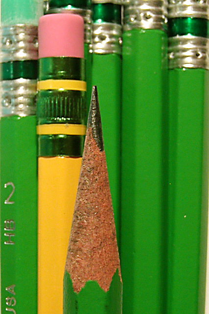
| Like the color and the off set of the yellow. A bit out of focus on the pencil in front but still very good. |
|
|
|
08/21/2002 02:50:00 PM |
I like this very much - would score higher if all the verticals were true vertical within the frame.
6, Kavey |
|
|
|
08/21/2002 06:31:00 AM |
| nice shot :) I like the concept of the single yellow pencil in the scene. That offers a nice bit of contrast and 'punch' in this photo. I wonder if the pencil on the left should have been turned so that the text doesn't show? Since it is not showing on any of the other pencils, I ask myself why you chose to show it on this one :) - good shot.. jmsetzler |
|
|
|
08/21/2002 06:29:00 AM |
| Definately made your point. :) At first, I was lik "wonder why the yellow pencil is in there", then I realized that if you had put another green one in there, I'd be asking "where's the color?" LOL. So I think it adds variety to your photo. The lighting is great. Angle and setup are good. The framing seems a slight bit off due to the white area in the bottom right, over all good job and good luck in the challenge. |
|
|
|
08/20/2002 09:19:00 PM |
| A bit soft on the focus, The one green eraser in the top left and the words just the left most pencil are distracting and ruins the symmetry. there is also some white background at the botttom right and what I think might be lighting glare on a ding in the right pencil. Good title and color contrast is good. Creative idea.... =5 syamjonimi |
|
|
|
08/20/2002 07:04:00 PM |
| Interesting composition and use of color. I like how you've used the vertical elements -- the pencil in the foreground somehow gets lost a little, by blending into the background elements. A different lighting treatment might help to separate the elements in the photo, or experiment with depth of field to make the front pencil obviously separate from the rest. |
|
|
|
08/20/2002 10:34:00 AM |
Very nicely done. Great focus. I like how only the one pencil has writing. Also good composition. Good work. 9
Ruthann |
|
|
|
08/20/2002 02:36:00 AM |
| Love the bold colors, good detail and lighting, but the arrangement of the pencils lacks something. It is interesting, but not "exciting". lhall |
|
|
|
08/19/2002 10:20:00 AM |
Good composition, but the green is a bit overwhelming....
Overall a pretty good image. |
|
|
|
08/18/2002 09:13:00 PM |
| I like it. The one yellow among all of the green and the one sharp point among all the erasers -- the fact that there are really two subjects vying for the eye is terrific. The pencils on the right are a bit out of focu and you're tilted a hair. I gave it a 7. I wish I could vote in .5's. |
|
|
|
08/18/2002 09:10:00 PM |
|