| Author | Thread |
Comments Made During the Challenge  |
|
|
11/22/2003 02:28:58 PM |
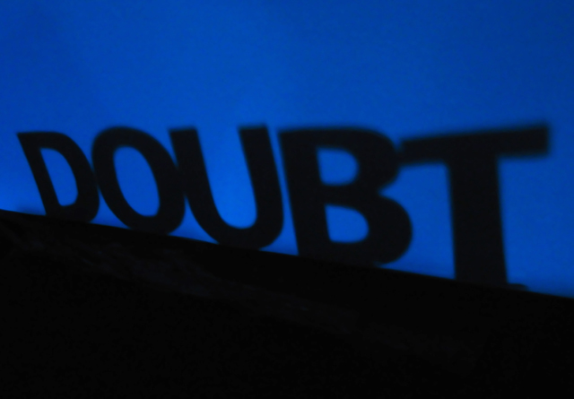
| I thought the comment was "A shadow of a doubt"?? Nonetheless I well taken shot! Blue and black works well together, nicely done! I find the composition to be a tad on the boring side though! |
|
 Photographer found comment helpful. Photographer found comment helpful. |
|
|
11/19/2003 05:45:17 PM |
| Clever. Nice blue and black combo. Like it alot. the d should be a bit smaller though, with the letters getting bigger- but heck- its still great. |
|
| Photographer found comment helpful. |
|
|
11/18/2003 03:07:05 AM |
|
| Photographer found comment helpful. |
|
|
11/17/2003 04:45:14 PM |
| Good Literalism, okay picture |
|
|
|
11/17/2003 02:13:20 PM |
| good idea. I think it could hae a little more kick to it if it were sharper and maybe leveled a little differently. |
|
| Photographer found comment helpful. |
|
|
11/17/2003 06:34:43 AM |
| Very good. I like this one so much. Top 3 or 5 for sure. Good luck this is super!!! |
|
| Photographer found comment helpful. |
|
|
11/17/2003 05:25:56 AM |
| Neat! I wish it weren't so grainy in the blue section! |
|
| Photographer found comment helpful. |
|
|
11/16/2003 07:23:56 PM |
| There is a littlle noise on the blue but nothing too horrid. I like the fact the lettering gets larger near the end, although the tops of the lettering blurs a little. Creative idea. |
|
| Photographer found comment helpful. |
Home -
Challenges -
Community -
League -
Photos -
Cameras -
Lenses -
Learn -
Help -
Terms of Use -
Privacy -
Top ^
DPChallenge, and website content and design, Copyright © 2001-2025 Challenging Technologies, LLC.
All digital photo copyrights belong to the photographers and may not be used without permission.
Current Server Time: 04/07/2025 12:16:46 AM EDT.