| Author | Thread |
|
|
03/05/2007 10:47:12 AM |
Greetings from the Critique Club. The following comments are in response to your request for a critique on your challenge submission. Please feel free to send me a PM concerning my comments.
First, welcome to DPChallenge and congratulations on entering your first image! I hope you'll consider entering more as it seems you have a pleasingly different way of approaching your subject.
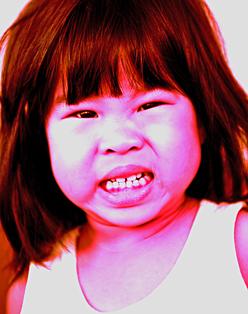
My first impression was that the image really screams at the viewer. I've seen children so angry they nearly turn that color pink with rage. Red is definitely the color of anger and hate for me.
Your commenters clearly expressed that they thought you went a bit too far with your color choice. I find it fun and reminiscent of Andy Warhol poster portraits. The only way to take it farther in the Warhol direction would be to apply filters to heighten the graphic quality of the image...which, of course, is not legal in Basic Editing challenges. I think if I were to suggest a change to the coloring it would be to tone down the red in the hair and shadows a bit more toward the fuscia range--the combination is perhaps a bit too jarring and unnecessary given the great expression on the girl's face.
This image certainly has impact! I feel her angry stare. The composition clearly focuses on the face as the hair and other elements frame this portrait. There's nothing un-wanted within the frame that would distract me from its message.
If this were simply a full-color portrait, then I'd have to agree with one commenter that the highlights on the face are blown out and lacking detail that we usually like to see. But I feel you made this choice intentionally and that it adds to idea behind the shot. Even the blur around her neck and shoulders helps make it feel like she has just quickly turned her head adding a bit of dramatic motion to the image. And her expression is priceless with the little wrinkles above her nose!
Overall, I can't find much wrong with this other than it's obviously not the kind of image the voters responded well to. So the only advice I can offer is don't always believe the voters and keep shooting!
--Kadi
(By the way, I'd love to see it again if you try a different post-process on it...please post it in the forums if you do.) |
|
 Photographer found comment helpful. Photographer found comment helpful. |
|
|
03/01/2007 05:15:35 AM |
| Now see - I liked this. The title totally pulled it together. Though not great, I think it should have gotten a better score just for originality. |
|
| Photographer found comment helpful. |
Comments Made During the Challenge  |
|
|
02/25/2007 02:57:57 PM |
| Nice photo, but I'd have preferred more natural colouring. |
|
| Photographer found comment helpful. |
|
|
02/25/2007 08:52:53 AM |
|
|
|
02/24/2007 06:07:40 PM |
| i like the picture, im not crazy aout the color. |
|
| Photographer found comment helpful. |
|
|
02/23/2007 08:50:46 AM |
| coloring detracts, not adds, to this (imho). - 4 |
|
| Photographer found comment helpful. |
|
|
02/23/2007 07:39:27 AM |
| Odd colors. blown highlites on her cheeks. |
|
| Photographer found comment helpful. |
|
|
02/22/2007 06:50:17 PM |
| The processing on this one hurts it for me. I know you were probably trying to emphasize the hatred/rage concept with the red face, but it's just a little too overkill. |
|
| Photographer found comment helpful. |
|
|
02/22/2007 01:42:09 PM |
| Wow... some way out there colour processing going on. Effective in that it commands attention but at the same time, is so loud that it steals attention away from the actual emotion you've captured in the girls expression. |
|
| Photographer found comment helpful. |
|
|
02/22/2007 11:52:05 AM |
| This would have been better without the bizzare processing. |
|
| Photographer found comment helpful. |
|
|
02/21/2007 07:57:49 PM |
| Um, im not sure why you Hued it to the max..? |
|
| Photographer found comment helpful. |
|
|
02/21/2007 05:59:44 PM |
| Great expression. I don't care for the color. |
|
| Photographer found comment helpful. |
|
|
02/21/2007 11:47:39 AM |
| I don't like the post processing. |
|
| Photographer found comment helpful. |
|
|
02/21/2007 08:10:58 AM |
| Sorry, I don't really like the over-saturation and red colors. But the face is very good, and this certainly fits the challenge! |
|
| Photographer found comment helpful. |
|
|
02/21/2007 04:38:57 AM |
| what happened to the colors here? hot pink isn't working for me at all ... |
|
| Photographer found comment helpful. |
|
|
02/20/2007 07:14:51 PM |
| la debiste haber dejado con los colores normales |
|
| Photographer found comment helpful. |
Home -
Challenges -
Community -
League -
Photos -
Cameras -
Lenses -
Learn -
Help -
Terms of Use -
Privacy -
Top ^
DPChallenge, and website content and design, Copyright © 2001-2025 Challenging Technologies, LLC.
All digital photo copyrights belong to the photographers and may not be used without permission.
Current Server Time: 04/07/2025 01:35:28 PM EDT.