| Author | Thread |
|
|
03/03/2007 07:42:02 PM |
Greetings from the Critique Club -
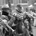
First thing I thought when I opened this image was that it was out of focus and I see that you tried to explain it in your notes. I looked at your file size as well as some of the file sizes of your previous images and I think I see where you may be losing alot of your detail. WHile you have the pixel dimensions maxed out you dont have your file size maxed out which could cause some serious lack of detail. This image is at just under 60kb which is nearly a third of what is allowed. THere is a great tutorial around here somewhere on how to save images for the web and maximize their impact. Give me a shout if you cant find it. But learning how to save for web properly could really affect your scores.
Now beyond that - you have an ok shot here. The guys look somewhat interesting but there really doesnt seem to be a story being told here. Has a feeling of a quick snapshot with not much purpose. Your b&w conversion is ok too but it could have a bit more impact being a bit more contrasty IMO. I am not really digging the border much. A simple black border would have done you better.
Overall though your editing and focus were really damaged by your file size. I think you could have scored several more tenths had it been the proper size. Again - give me a shout if you cant find that tutorial and I will be more than happy to help out. It took me several challenges in to realize that I was not doing something right. Hope this helps!
Tim |
|
|
|
02/26/2007 04:51:07 AM |
Thanks for the votes everyone.
I noticed many of the commenters mentioned the picture being out of focus. When you look at the image in its original size you can see my focal point was on the guy to the right. I did this specifically because the heat from the fire in the middle of the image distorted things in the middle and made them appear wavy.
|
|
Comments Made During the Challenge  |
|
|
02/25/2007 05:04:18 AM |
great shot, makes me really feel the cold and warming of the hands. bumping up two point.
The only thing i would change would be the contrast of the shot. I would really push this up. |
|
 Photographer found comment helpful. Photographer found comment helpful. |
|
|
02/20/2007 10:56:05 PM |
| great story shot! the title is too long and clunky. it could be called just "Degrees," "4 Degrees" or if you want a near rhyme: "Three Degrees" which would also make the viewer wonder if you were talking about the weather or the 3 men and their college education. good luck in the challenge! |
|
| Photographer found comment helpful. |
|
|
02/19/2007 01:28:17 PM |
| Few stories here... I just find the border one more distracting element here. |
|
| Photographer found comment helpful. |
|
|
02/19/2007 12:32:48 PM |
| good capture, but could be much sharper. fram doesn't add |
|
| Photographer found comment helpful. |
|
|
02/19/2007 11:41:00 AM |
| They do look cold, don't they? Interesting location shot, but it's a bit soft. |
|
| Photographer found comment helpful. |
|
|
02/19/2007 07:28:16 AM |
| This picture isn't in focus |
|
Home -
Challenges -
Community -
League -
Photos -
Cameras -
Lenses -
Learn -
Help -
Terms of Use -
Privacy -
Top ^
DPChallenge, and website content and design, Copyright © 2001-2026 Challenging Technologies, LLC.
All digital photo copyrights belong to the photographers and may not be used without permission.
Current Server Time: 02/01/2026 09:44:02 AM EST.