| Author | Thread |
|
|
02/17/2007 10:55:31 PM |
| This is a masterpiece Hanneke! |
|
 Photographer found comment helpful. Photographer found comment helpful. |
|
|
02/17/2007 10:19:37 PM |
| Girlie gal - this is awesome!!! |
|
| Photographer found comment helpful. |
|
|
02/17/2007 10:06:38 PM |
|
| Photographer found comment helpful. |
|
|
02/17/2007 09:11:28 PM |
| love the high key with the black |
|
| Photographer found comment helpful. |
|
|
02/17/2007 09:06:30 PM |
|
| Photographer found comment helpful. |
|
|
02/17/2007 07:28:39 PM |
| Outstanding shot. Best of great serie. Adorable! |
|
| Photographer found comment helpful. |
|
|
02/17/2007 02:28:25 PM |
| Very interesting shot... I absolutely love it! |
|
| Photographer found comment helpful. |
|
|
02/17/2007 02:25:12 PM |
| F**kin A! This shot is AWESOME! Best I have seen from you so far Hanneke, keep it up :) |
|
| Photographer found comment helpful. |
|
|
02/17/2007 02:20:14 PM |
|
| Photographer found comment helpful. |
|
|
02/17/2007 01:10:17 PM |
|
| Photographer found comment helpful. |
|
|
02/17/2007 12:58:24 PM |
I know I know!!! haha!
I should've!! |
|
|
|
02/17/2007 12:57:03 PM |
So much for saving THAT one for the free study huh?
;)
Very professional results in every way. |
|
| Photographer found comment helpful. |
|
|
02/17/2007 12:48:56 PM |
wow, this is great - good depth, lighting, mood.
album cover?
|
|
| Photographer found comment helpful. |
|
|
02/17/2007 12:42:51 PM |
| definitely my favorite... shows TONS of style. great job and great collection! :) [but this one would be on my wall if i shot it.] ;) |
|
| Photographer found comment helpful. |
|
|
02/17/2007 12:34:12 PM |
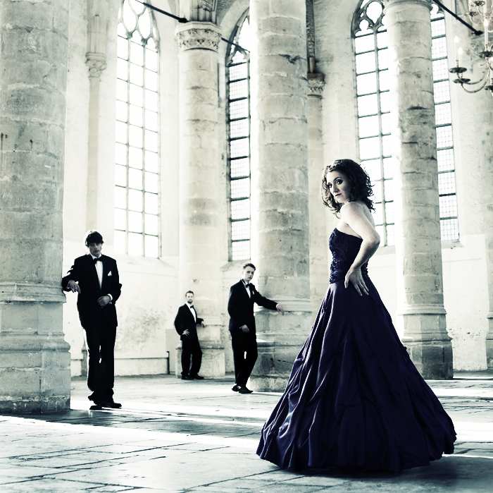
thanks!
PP (pfff, lots!)
several layers:
b/w
curves
2 urban acid layers (muted colors & color curve adjustment)
one background copy
burned a lot on the pilars at the background.
here's a b/w version without the burning:

it's nice to compare them to eachother. I was really doubting wich one to use, I like them both ;)
Message edited by author 2007-02-17 12:37:07. |
|
|
|
02/17/2007 12:18:16 PM |
I love this one. My fav out of the ones you posted, brilliant! It wouldnt look out of place on an album cover, or in a magazine, or anywhere, it's great! :) What was the PP on it?
Message edited by author 2007-02-17 12:18:35. |
|
| Photographer found comment helpful. |
|
|
02/17/2007 11:40:37 AM |
| Awesome serie of photo. Thay have a nice antique touch. |
|
| Photographer found comment helpful. |
|
|
02/17/2007 11:22:29 AM |
| i think this is my favourite in this series. i like the light and especially the tones a lot in this one. the composition and DOF are fantastic. |
|
| Photographer found comment helpful. |
|
|
02/17/2007 11:18:53 AM |
| This would appear in a high end fashion magazine and you'd be paid mega bucks to do it. FANTASTIC!! Everything about it speaks class and elegance. |
|
| Photographer found comment helpful. |
|
|
02/17/2007 10:27:44 AM |
| What a phenominal location. I think luck was in your favor in that the strobes DIDN'T work because I love the natural light. The composition on this one is very striking! |
|
| Photographer found comment helpful. |
Home -
Challenges -
Community -
League -
Photos -
Cameras -
Lenses -
Learn -
Help -
Terms of Use -
Privacy -
Top ^
DPChallenge, and website content and design, Copyright © 2001-2026 Challenging Technologies, LLC.
All digital photo copyrights belong to the photographers and may not be used without permission.
Current Server Time: 02/01/2026 11:13:14 AM EST.