| Author | Thread |
|
|
03/05/2007 10:26:27 AM |
Greetings from the Critique Club. The following comments are in response to your request for a critique on your challenge submission. Please feel free to send me a PM concerning my comments.
First let me say that by now I'm sure you've realized that the voters feel your images are too small to really appreciate. There is a good tutorial on resizing images for DPChallenge submissions using PhotoShop. (Look under the "Learn" drop-down menu.) If you are using other software and need help maximizing you images a post in the forums will usually bring replies quite quickly.
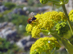
The subject of this image seems to be a bee on yellow flowers. The color is strong and interesting. The depth of field keeps the bee in focus while beginning to blur the background.
The composition is rather ordinary. Placing the subject in the center of the frame tends to stop the viewer from exploring the rest of the image. One looks and says, oh it's a bee. Cropping down from the top and in from the right would help move the bee off center and would also eliminate the distraction of the cut-off flower at the top.
The background is blurry helping to keep the eye on the subject. But because there is so much color and texture detail in the background it fights for attention. Ideally you want to eliminate distraction by repositioning so there is a plainer background or waiting for the light to change so the background can be thrown into shadow.
The subject itself begs for the viewer to be closer. It's nice to enjoy the texture and detail of bugs. As a subject for the challenge...well, if the title says it's love it must me, right?
My rule of thumb on images is that everything necessary should be in the image and everything in the image should be necessary.
Overall, it's the sort of image almost everyone with a camera has taken at some time.
I hope you don't find my comments too harsh.
Keep shooting!
--Kadi
|
|
Comments Made During the Challenge  |
|
|
02/27/2007 09:54:58 AM |
| Lighting is good, nice idea. I only wished it was bigger. |
|
|
|
02/27/2007 02:34:46 AM |
| I think darkening the background would make this pop more. |
|
|
|
02/26/2007 05:42:30 PM |
| Too far away and too small |
|
|
|
02/25/2007 02:32:41 PM |
|
|
|
02/24/2007 09:47:58 AM |
|
|
|
02/23/2007 09:23:54 AM |
|
|
|
02/23/2007 04:30:10 AM |
|
|
|
02/21/2007 03:00:49 PM |
| a bit small. Would love to see the details. |
|
|
|
02/21/2007 01:51:06 PM |
|
|
|
02/21/2007 06:43:35 AM |
| a little out of focus but nice capture |
|
|
|
02/21/2007 06:26:26 AM |
|
|
|
02/21/2007 01:29:13 AM |
|
|
|
02/20/2007 11:45:10 PM |
|
Home -
Challenges -
Community -
League -
Photos -
Cameras -
Lenses -
Learn -
Help -
Terms of Use -
Privacy -
Top ^
DPChallenge, and website content and design, Copyright © 2001-2025 Challenging Technologies, LLC.
All digital photo copyrights belong to the photographers and may not be used without permission.
Current Server Time: 04/07/2025 01:10:31 PM EDT.