| Author | Thread |
|
|
11/28/2003 10:02:12 PM |
Greetings from the Critique Club :)
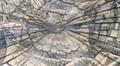
This photo seems to meet the challenge without much problem at all. I think it falls short photograpically for one primary reason. The image contains no depth or texture. These elements certainly are not requirements for a photograph, but they do seem to work nicely together to create more visual appeal.
I also think the depth of field here may be too shallow and in the wrong place. I can't really do anything but guess at that since the exposure data isn't posted with the image.
The score you received seems to indicate that the general population did not find a high level of interest in the image. I think the composition and subject choice probably contributed to that. It's rare that two-dimensional images do well here. You need that third dimension of depth :)
|
|
Comments Made During the Challenge  |
|
|
11/19/2003 10:51:31 PM |
| It seems to be over my head- but then the simplicity is there. and there is no connection really- adn thats the thing. so i guess it works. |
|
|
|
11/17/2003 12:28:23 PM |
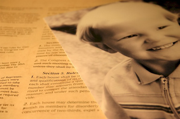
| Love the sepia tones. This photo is not really in focus, but I think it totally works. This picture has a lot of expression, and is far from boring. Nice work |
|
Home -
Challenges -
Community -
League -
Photos -
Cameras -
Lenses -
Learn -
Help -
Terms of Use -
Privacy -
Top ^
DPChallenge, and website content and design, Copyright © 2001-2026 Challenging Technologies, LLC.
All digital photo copyrights belong to the photographers and may not be used without permission.
Current Server Time: 02/01/2026 09:43:50 AM EST.