| Author | Thread |
Comments Made During the Challenge  |
|
|
02/19/2007 10:28:38 PM |
|
|
|
02/15/2007 10:57:16 AM |
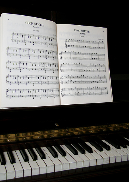
| The composition feels too divided, it needs some depth to the blacks to define the space between the keys and music. |
|
 Photographer found comment helpful. Photographer found comment helpful. |
|
|
02/14/2007 06:17:40 PM |
| I dont like the disappearing edge of the music page on the left. It deserves at least sliver of black to make it stand out |
|
| Photographer found comment helpful. |
|
|
02/14/2007 03:37:03 PM |
|
| Photographer found comment helpful. |
|
|
02/14/2007 01:20:49 PM |
| Technically - the lighting could use some work - more light on the keys would probably help. Also, the cropping seems a little off - there is a big black area to the right of the music that makes this seem offset. It is not a bad image, but could use a little more punch. To really add to this, getting someone in the image to actually practice or pretend to play would add a story to the image. |
|
| Photographer found comment helpful. |
Home -
Challenges -
Community -
League -
Photos -
Cameras -
Lenses -
Learn -
Help -
Terms of Use -
Privacy -
Top ^
DPChallenge, and website content and design, Copyright © 2001-2025 Challenging Technologies, LLC.
All digital photo copyrights belong to the photographers and may not be used without permission.
Current Server Time: 04/08/2025 01:37:57 AM EDT.