| Author | Thread |
|
|
02/21/2007 07:26:41 AM |
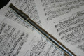
Wow, you ended up with a lot of comments here. I like the minimalism in the shot, but it needed a bit better lighting to come off the way you probably wanted it to. Someone pointed out the shadows under the mouthpiece for instance. I'm not an expert with lighting, but trying to light something this wide, maybe reflecting some light upward onto a reflective surface that shined back down on the flute would have worked? These basic editing challenges are much harder because you can't make those fixes in individual spots with the post processing. Go team D50!
As an afterthought... I think this also feels backwards to me, since I would hold the flute with the mouthpiece at the left if I were playing it. Might not make for the keys looking as neat though. Hmm.
Message edited by author 2007-02-21 12:28:26. |
|
 Photographer found comment helpful. Photographer found comment helpful. |
Comments Made During the Challenge  |
|
|
02/20/2007 07:31:43 AM |
| Kinda dark, nice composition. |
|
| Photographer found comment helpful. |
|
|
02/18/2007 09:19:28 PM |
| very cool, i like the minimalism. |
|
| Photographer found comment helpful. |
|
|
02/18/2007 11:22:52 AM |
|
| Photographer found comment helpful. |
|
|
02/17/2007 08:17:26 PM |
| perfectly simple...also helps that I play the flute. 10 |
|
| Photographer found comment helpful. |
|
|
02/17/2007 12:02:03 PM |
| Nice use of negative space! Would have liked the flute to be more clearly lit. Harsh shadow fall off on right under the mouthpiece. |
|
| Photographer found comment helpful. |
|
|
02/17/2007 11:45:15 AM |
| love the punch this gives you like " WHAM, flute. " |
|
| Photographer found comment helpful. |
|
|
02/17/2007 01:45:47 AM |
| Lovely. Nicely photographed instrument. Simple and to the point. |
|
| Photographer found comment helpful. |
|
|
02/15/2007 07:22:59 PM |
| Flute is a touch low in the photo. Perhaps not such a tight crop on the bottom. |
|
| Photographer found comment helpful. |
|
|
02/15/2007 03:18:17 PM |
Nice range on the flute, but the cropping leave ALOT of black to distract from the focus.
7 |
|
| Photographer found comment helpful. |
|
|
02/15/2007 11:07:20 AM |
| not enough space is being taken up by the flute, or something else like sheet music for example. not sure if the negative space works |
|
| Photographer found comment helpful. |
|
|
02/14/2007 01:53:22 PM |
| The flute in the image is just not bright enough to compensate for all the dark negative space above it. It's a neat idea, but better lighting is probably needed to make this work really well. |
|
| Photographer found comment helpful. |
Home -
Challenges -
Community -
League -
Photos -
Cameras -
Lenses -
Learn -
Help -
Terms of Use -
Privacy -
Top ^
DPChallenge, and website content and design, Copyright © 2001-2025 Challenging Technologies, LLC.
All digital photo copyrights belong to the photographers and may not be used without permission.
Current Server Time: 04/07/2025 02:46:57 PM EDT.