| Author | Thread |
|
|
12/06/2003 07:18:41 PM |
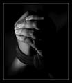
Originally posted by blindjustice:
fantastic... but the blade of the sword shows digital flaws. The focus could be sharper too. |
Are those "flaws" a partial reflection of your face?
I think I'd have solved the "centering" problem by having the sword 10-30 degrees off from the vertical towards the right; but maybe that's because I remember once reading a version that had a drawing like that. I think I've also seen it where the sword went right through an anvil and into the stone on which it was mounted.
I like how you did the background, but the lighting does make it look a little like a museum exhibit, rather than a scene from a Middle Ages village. |
|
 Photographer found comment helpful. Photographer found comment helpful. |
|
|
12/06/2003 06:30:00 PM |
moodville,
Just for the record, I was an English major and had 3 semesters in Arthurian Literature. Le Morte D'Artur was one of several that I read. Although as you surmise, I'm likely an exception.
Just added to my favorites. Recently had opportunity to travel to Ireland and spent a fair time in cemetary's photographing celtic crosses. Thanks for the photo. |
|
| Photographer found comment helpful. |
Comments Made During the Challenge  |
|
|
11/18/2003 11:24:21 AM |
| I really like the background and the DOF of this shot, nicely done. |
|
| Photographer found comment helpful. |
|
|
11/18/2003 10:07:21 AM |
| Don't know how you did it but it's really good. My vote 10!!!! |
|
| Photographer found comment helpful. |
|
|
11/18/2003 03:15:12 AM |
| Despite the centered subject matter, I like the composition and especially the colored background. I think what's missing is lack of visual detail of the interesting looking sword, which I think should be lit better. Also, more accoutrements of that period of history would also add more interest, such as, a draped robe or shield. |
|
| Photographer found comment helpful. |
|
|
11/17/2003 04:46:01 AM |
Everything came together nicely here. I like the lighting and DOF. 9 -danny
|
|
| Photographer found comment helpful. |
|
|
11/17/2003 03:51:36 AM |
|
|
|
11/16/2003 03:18:26 PM |
| Great photo. I thought of this title, but didn't think I could do the photo that well. Good contrasting background. I might have tried a little closer crop to see if I could get more detail on the sword, but its still well done. |
|
| Photographer found comment helpful. |
|
|
11/15/2003 11:42:47 PM |
|
|
|
11/15/2003 07:34:09 PM |
| Lovely interpretation of this book. Love the mottled background that totally fits with the image. The shallow DOF is great in this shot. Sharpness is good. In terms of composition, I think it either needs to be centered or more off-center. The way it is now, it is kind of in between which makes it a bit less powerful. Othewise great photo. |
|
| Photographer found comment helpful. |
|
|
11/15/2003 11:47:04 AM |
|
|
|
11/14/2003 04:51:39 PM |
| Good shot, very creative for the subject |
|
| Photographer found comment helpful. |
|
|
11/14/2003 03:39:40 PM |
| fantastic... but the blade of the sword shows digital flaws. The focus could be sharper too. |
|
| Photographer found comment helpful. |
|
|
11/14/2003 10:39:46 AM |
| The primary focus is lost in the background in parts. like the general composition, althought he rock is taking a lot of focus to the bottom of the frame. |
|
| Photographer found comment helpful. |
|
|
11/14/2003 10:30:49 AM |
the background you used is very beautiful, what was it ?
the different textures in contrast to the smooth steel works very well :D
great job on this ! 10 |
|
| Photographer found comment helpful. |
|
|
11/14/2003 09:35:36 AM |
|
|
|
11/14/2003 06:30:56 AM |
| oo wow! very nice! theres something about this picture tho that i cant quite put me finger on, but seein as i cant think what it is I wont mark u down! |
|
| Photographer found comment helpful. |
|
|
11/14/2003 06:24:00 AM |
clean and good image
reflections are nice, composition gives a natural feel |
|
| Photographer found comment helpful. |
|
|
11/13/2003 03:24:15 PM |
| great shot, funky blurred BG |
|
| Photographer found comment helpful. |
|
|
11/13/2003 03:17:37 AM |
| Good lighting, background |
|
| Photographer found comment helpful. |
|
|
11/13/2003 01:58:19 AM |
| The sword is gorgeous. I like the contrast of textures between the stone and the sword. The lighting brings it out well. |
|
| Photographer found comment helpful. |
|
|
11/12/2003 11:39:38 PM |
| Nice lighting and exposure and I do like the background. Just the right amount of foreground rock included too. I'm not sure whether the decision to have the sword off-centre horizontally was deliberate - if so I think it needs to be more off centre than it is. As it is now it just looks as though you'd intended to centre it and hadn't quite achieved that. |
|
| Photographer found comment helpful. |
|
|
11/12/2003 06:59:49 PM |
| nice, I think more lighting to frame the sword and less background lighting woudl have helped... nice colors. |
|
| Photographer found comment helpful. |
|
|
11/12/2003 04:31:04 PM |
| Very nice one! I love the lights. I would have cropped perfectly centered. But I still like it very much. 9 |
|
| Photographer found comment helpful. |
|
|
11/12/2003 03:20:06 PM |
| I know that you're probably trying to play by the 'rules' of composition here, but I feel that this one would have been stronger if you'd placed the sword right in the middle. The detail is great though, and I like the use of DOF. |
|
| Photographer found comment helpful. |
|
|
11/12/2003 01:07:37 PM |
| nice dagger/sword, a favorite part of a favorite book for me, I wish the background were a little less busy, although I like the color |
|
| Photographer found comment helpful. |
|
|
11/12/2003 10:54:21 AM |
| Really pretty....I love the title/shot together. I would of like the bottom cropped a bit more to remove the harsh light there in the center. Background is killer good!! The sword is also awesome. Good luck in the challenge. |
|
| Photographer found comment helpful. |
|
|
11/12/2003 09:03:44 AM |
| nice, but I'd crop a bit different so the sword wouldn't be totally centered. |
|
| Photographer found comment helpful. |
|
|
11/12/2003 07:49:06 AM |
| Excellent. Great background and lighting. This is the winner in my books. |
|
| Photographer found comment helpful. |
|
|
11/12/2003 05:26:56 AM |
| i think this type of thing would have benfited from either a completely center or completely off center composition..it's kinda in limbo right now...exposure and sharpness are good and background color are nice as well...6 |
|
| Photographer found comment helpful. |
|
|
11/11/2003 08:51:37 PM |
| Niice capture, good DOF, but the composition could be more interesting (this one's centered, and the rock in front of the sword takes away from sword being the focal point. |
|
| Photographer found comment helpful. |
|
|
11/11/2003 07:43:17 PM |
| Excellent photo. I love the way the sword & stone both pop against the background. Focus is great, lighting is good too. I really like the marbled look of the background, gives it an old-world feel. Very well done. 8 |
|
| Photographer found comment helpful. |
|
|
11/11/2003 07:20:45 PM |
| This is a wonderful shot, I love the lighting and the marble effect of the background. great job! |
|
| Photographer found comment helpful. |
Home -
Challenges -
Community -
League -
Photos -
Cameras -
Lenses -
Learn -
Help -
Terms of Use -
Privacy -
Top ^
DPChallenge, and website content and design, Copyright © 2001-2025 Challenging Technologies, LLC.
All digital photo copyrights belong to the photographers and may not be used without permission.
Current Server Time: 04/07/2025 12:51:50 PM EDT.