| Author | Thread |
Comments Made During the Challenge  |
|
|
11/18/2003 03:26:09 PM |
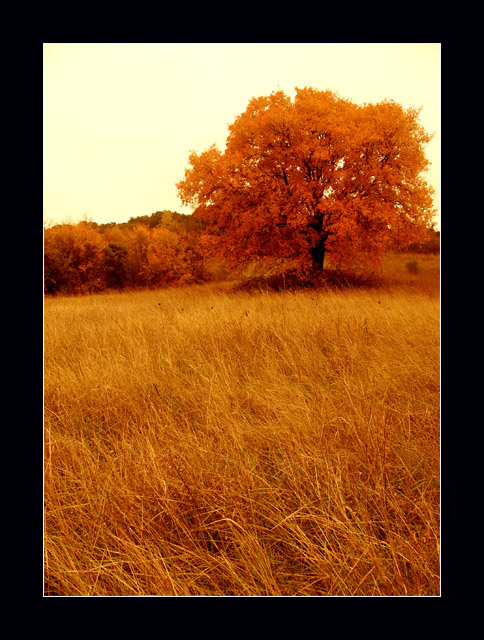
| I think this is a beautiful shot, but I find the border very overdone and a distraction to the beauty of your shot. 8 |
|
 Photographer found comment helpful. Photographer found comment helpful. |
|
|
11/17/2003 09:48:38 AM |
| Pretty shot with great tones and textures. The horizon may be off just a little. 9 -danny |
|
| Photographer found comment helpful. |
|
|
11/17/2003 08:35:55 AM |
| You sure this wasn't the cover art?? ;) Fantastic job! |
|
| Photographer found comment helpful. |
|
|
11/16/2003 11:13:01 PM |
| Stunning composition. The long field with the very sharp front is beautiful and draws your eye into the photograph . The all white sky is a little disconcerting at first but the more I look at it the more I like it. Did you have to do a lot of color adjustment, I wonder. -9 |
|
| Photographer found comment helpful. |
|
|
11/16/2003 08:39:44 AM |
| Beautiful shot but this thick black border does nothing for it in my opinion. |
|
| Photographer found comment helpful. |
|
|
11/16/2003 12:06:33 AM |
| Love this image. It has golden peaceful feeling. Good sharpness and composition. But please stay away from those dreadful black overpowering borders. A border half the size would have been much more tasteful. This is an overkill. No points taken off for this as the photo itself it very nice. |
|
| Photographer found comment helpful. |
|
|
11/15/2003 09:47:50 PM |
| Beautiful picture, the grasses in particular are really good to look at. IMHO the border is a bit heavy - the picture has a delicacy about it that the border doesn't support. I hope you don't mind, but I downloaded the picture and took off the black border and the 1 px white, and added the same size border but in a light tan, using a colour from the grasses, but much lighter. To my eyes something like that complements this beautiful picture better than the heavy black. But it is a beautiful shot! ~8 |
|
| Photographer found comment helpful. |
|
|
11/15/2003 03:15:26 PM |
| I love all the orange, separated by different shapes and textures. It is so simple, and fine. The frame really makes it pop. 9 |
|
| Photographer found comment helpful. |
|
|
11/14/2003 08:50:50 PM |
| Its very...gold. The dark border really contrasts the colors in the picture, nice touch but the contrast can be alittle overpowering at first. |
|
| Photographer found comment helpful. |
|
|
11/14/2003 07:57:16 PM |
| wonderful colors, great black border, nice work |
|
| Photographer found comment helpful. |
|
|
11/14/2003 03:49:57 PM |
| The broard black frame is a bit overpowering for such a natural image 8 |
|
| Photographer found comment helpful. |
|
|
11/14/2003 11:13:52 AM |
|
| Photographer found comment helpful. |
|
|
11/14/2003 02:57:37 AM |
| I can really see this as a book cover. nice use of negitive space left for book title and graphics |
|
| Photographer found comment helpful. |
|
|
11/13/2003 11:59:29 PM |
| beautiful browns... blown out sky unfortuanate, but beautiful. Did you use a polarizer? |
|
| Photographer found comment helpful. |
|
|
11/13/2003 08:10:13 PM |
| Ooo I saw this on DeviantArt earlier. Love it! |
|
| Photographer found comment helpful. |
|
|
11/13/2003 08:07:05 PM |
|
| Photographer found comment helpful. |
|
|
11/13/2003 04:09:36 PM |
| I like the shot very much.. Did you try less orange, so the grass looked more natural (straw colored). Anyway good job. |
|
| Photographer found comment helpful. |
|
|
11/13/2003 01:01:40 PM |
| Great color, good detail. |
|
| Photographer found comment helpful. |
|
|
11/13/2003 10:25:34 AM |
|
| Photographer found comment helpful. |
|
|
11/13/2003 07:01:50 AM |
| A nice entry for the "Grace" challenge. Is there really a book by this name? I like the near monochrome effect - all shades of orange. |
|
| Photographer found comment helpful. |
|
|
11/13/2003 04:21:00 AM |
| A lovely image, with the exception of the sky, which pulls it down somewhat. It's a little bright and bland to complement the rich colours of the foliage. |
|
| Photographer found comment helpful. |
|
|
11/13/2003 02:55:13 AM |
|
| Photographer found comment helpful. |
|
|
11/12/2003 11:11:50 AM |
| Wonderful composition, but I think yellow may be a bit over-saturated and the frame is a bit too heavy for my taste. Over all a great photo. 7 |
|
| Photographer found comment helpful. |
|
|
11/12/2003 10:48:52 AM |
| Very nice, looks like something you\'d see on one of those inspirational posters. Good fall colors, we didn\'t get anything remotely that beautiful near where I live. |
|
| Photographer found comment helpful. |
|
|
11/12/2003 07:45:49 AM |
| the subject is placed well and the framing is also good. nice work! 7. |
|
| Photographer found comment helpful. |
|
|
11/12/2003 06:20:08 AM |
| A bit blurry on trees. May be the light effect or shutter a little lower |
|
| Photographer found comment helpful. |
|
|
11/12/2003 03:43:18 AM |
| beautiful tones. i like the big border too! |
|
| Photographer found comment helpful. |
Home -
Challenges -
Community -
League -
Photos -
Cameras -
Lenses -
Learn -
Help -
Terms of Use -
Privacy -
Top ^
DPChallenge, and website content and design, Copyright © 2001-2026 Challenging Technologies, LLC.
All digital photo copyrights belong to the photographers and may not be used without permission.
Current Server Time: 02/01/2026 05:46:55 AM EST.