Hello from the Critique Club!
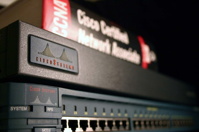
I really like the different aspects coming into play in this photograph. I find the contrasts very nice, the composition to be great and I think the lighting is good as well. On the other hand I think the focus and cropping could use a little tweaking. Let's go into more depth:
The cropping issue I think is very minor, its more of a personal preference for me. I think that corner in the top left should be cropped to right where the book starts because the other side has a nice consistant blackness and the two tone background on the left gives it a bit of an off-balance. I also think a less close crop at the bottom - allowing the area just below mode to show so the wording isn't crowded at the bottom of the photo would give a more finished look.
Your focus choice is great, I really like the DOF use, but I have to agree with some of the other commenters in that I think a slightly longer field would have been better. Certainly I don't think the whole image should be in sharp focus, but I think allowing the eye a longer area of crispness would improve the image a bit.
The lighting is great. It really highlights the sharp focus on the left and helps create that nice shadow trailing into oblivion on the right.
The composition is excellent in my opinion. I know others wondered about having the book in the photo, but I found it a great reference as a viewer because I have no clue what your title (CCNA) would have stood for or how it would relate to the photograph without it. I think keeping it out of focus was also an excellent idea because it then doesn't become an obvious focal point for the eye, but instead merely a reference point.
Finally I love the contrasts, both in the muted colors shown on the electronic components against the bright red and white of the book and also the contrast between sharp and soft focus, and I especially like the subtle contrast with the play of the light on the left against the shadowed area of the right.
I think this could have been a very flat photograph but you've brought out enough contrasting elements and added some other interest points (as mentioned above) to give the image a nice bit of oomph. I notice a few conflicting comments below and I think the subject matter may have hurt your score, but I find it to be a nice solid image. Nicely done. |