| Author | Thread |
|
|
02/03/2007 05:30:14 PM |
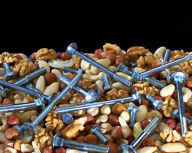
| I would have done nuts and bolts. I agree on the black too - too stark a contrast from the colours of the remainder of the image. |
|
 Photographer found comment helpful. Photographer found comment helpful. |
|
|
02/02/2007 06:23:47 PM |
| Nice concept, I agree with the others re the black space, also I don't like the bright bottom lighting, that needed to be more diffuse IMO. |
|
| Photographer found comment helpful. |
|
|
02/02/2007 05:58:36 PM |
idea is clever ...
exposure is good and the mix works well. i agree with the other commenters that the black space is distracting because it serves no purpose. |
|
| Photographer found comment helpful. |
|
|
02/02/2007 05:18:50 PM |
| I am distracted by the black part at the top. Not exactly sure what you could do about it though. Maybe fill the frame with the content and not have any black. Or maybe have the stuff in a bowl on a table in front of a nice fireplace or some comforting scene... My two cents anyways. |
|
| Photographer found comment helpful. |
|
|
02/02/2007 05:18:42 PM |
| The focus is wonderful. Lighting just a tad bright on those shiny new bolts. I may have used older ones that aren't so shiny. |
|
| Photographer found comment helpful. |
|
|
02/02/2007 05:11:01 PM |
oh, you mean nuts is the same word as nuts? Who'da thunk it? A lot of people, actually. If you want funny, you gotta surprise a little.
//thingsihate.org/article/436/zirealism |
|
| Photographer found comment helpful. |
Home -
Challenges -
Community -
League -
Photos -
Cameras -
Lenses -
Learn -
Help -
Terms of Use -
Privacy -
Top ^
DPChallenge, and website content and design, Copyright © 2001-2025 Challenging Technologies, LLC.
All digital photo copyrights belong to the photographers and may not be used without permission.
Current Server Time: 04/07/2025 09:23:04 PM EDT.