| Author | Thread |
|
|
02/14/2007 03:49:28 AM |
| It's a nice shot - but on my laptop screen it looks like hell. On my graphics screen it looks much better. |
|
 Photographer found comment helpful. Photographer found comment helpful. |
Comments Made During the Challenge  |
|
|
02/13/2007 06:50:18 PM |
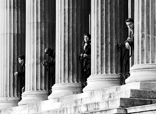
| Wonderful! Now the question of was this a natural discovery, or did you set it up? Either way it doesn't matter, it's a marvelous photo. I love the B/W tone, you've covered the range very well. The repeating pattern and discrete diagonal lines also adds to the dynamic here. Bravo! Good luck in the challenge. |
|
| Photographer found comment helpful. |
|
|
02/13/2007 01:59:45 PM |
| This is my other blue ribbon. I like the thematic notion that segregation emanates downward from the places of power. 10 |
|
| Photographer found comment helpful. |
|
|
02/09/2007 01:40:48 PM |
|
| Photographer found comment helpful. |
|
|
02/09/2007 07:51:59 AM |
| Great idea. I really like this shot. The B&W really takes you back to the day. I think this shot meets the challenge better than any I've seen so far. Good job, 10. |
|
| Photographer found comment helpful. |
|
|
02/08/2007 03:21:41 PM |
|
| Photographer found comment helpful. |
|
|
02/07/2007 02:48:44 PM |
| Excellent capture. You've done a perfect job giving this photo a "dated" look. |
|
| Photographer found comment helpful. |
|
|
02/07/2007 04:26:42 AM |
| Interesting capture. The image itself is pretty cool - the b&w offers a nice gritty feel. But the title sends it into another direction alltogether. Bad titles I dont usually subtract points for but good ones are a plus. Your title helps guide your vision of the image quite well. Bumping up to 8. |
|
| Photographer found comment helpful. |
|
|
02/06/2007 10:28:56 PM |
| Fine photo, but bad? Only the title. Still get a 6 because it's a fine photo. |
|
| Photographer found comment helpful. |
Home -
Challenges -
Community -
League -
Photos -
Cameras -
Lenses -
Learn -
Help -
Terms of Use -
Privacy -
Top ^
DPChallenge, and website content and design, Copyright © 2001-2025 Challenging Technologies, LLC.
All digital photo copyrights belong to the photographers and may not be used without permission.
Current Server Time: 04/07/2025 01:15:31 PM EDT.