| Author | Thread |
|
|
02/04/2007 02:01:12 AM |
very grim. i agree with all the technical comments, and would also suggest b/w.
a great start to the porject! |
|
|
|
02/03/2007 01:44:56 AM |
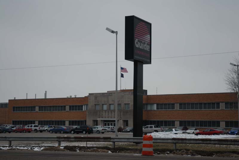
| I think this is a good attempt to convey something about the plant closing, and the dismal way it must feel to be in that area; I've had large plants (not auto) close near where I lived, and driving by them was like driving by a sad ghost town, and this was worse on dreary days; I get that dark feeling from your photo, though I think the composition comments (moving the sign from center) would probably help overall. |
|
 Photographer found comment helpful. Photographer found comment helpful. |
|
|
02/01/2007 06:43:00 PM |
| it's sad that all those people lost their jobs. I have a brother that lost his job at a Ford Plant that closed. |
|
|
|
02/01/2007 06:28:44 PM |
| I think the darkness of the image helps convey the dark times the auto industry has been facing the past few years |
|
| Photographer found comment helpful. |
|
|
02/01/2007 06:03:25 PM |
| I think this would look good cropped in a little as well. |
|
|
|
02/01/2007 02:31:06 PM |
| Having grown up just outside of the Motor City (Detroit) I can assure everyone ... this is exactly what GM plants look like. They're not beautiful, but they sure do say a lot about the area. |
|
|
|
02/01/2007 02:02:46 PM |
| A little dark and what exactly is going on here? |
|
|
|
02/01/2007 11:51:35 AM |
|
|
|
02/01/2007 09:22:58 AM |
| Yes a little dark and the sign is a bit too centered but it looks like it was cold and you probably didn't want to walk around much to get the perfect shot. Good job. |
|
| Photographer found comment helpful. |
|
|
02/01/2007 09:14:36 AM |
| I agree alittle dark but its nicely framed, the flag that is, so maybe just crop some on the right and it would help alot I think. |
|
| Photographer found comment helpful. |
|
|
02/01/2007 09:12:51 AM |
| I agree with Megatherian about shooting closer to get a bit more detail of those markings. It's an interesting looking building with an interesting history I am guessing. |
|
| Photographer found comment helpful. |
|
|
02/01/2007 09:07:27 AM |
Interesting subject. The flag inclusion of the flag is a nice touch.
Suggestions for improvement (IMHO): It's a little dark overall. With the way the signs are placed it seems a bit too centered, if you could have shot from a few hundred yards to you left it probably would have been a bit stronger compositionally.
There are some interesting markings on the front cement part of the building. I would have been tempted to shoot much closer to give them a lot more attention. |
|
| Photographer found comment helpful. |
Home -
Challenges -
Community -
League -
Photos -
Cameras -
Lenses -
Learn -
Help -
Terms of Use -
Privacy -
Top ^
DPChallenge, and website content and design, Copyright © 2001-2025 Challenging Technologies, LLC.
All digital photo copyrights belong to the photographers and may not be used without permission.
Current Server Time: 04/08/2025 04:54:15 AM EDT.