| Author | Thread |
|
|
11/25/2003 10:57:47 PM |
Hello from the Critique Club!
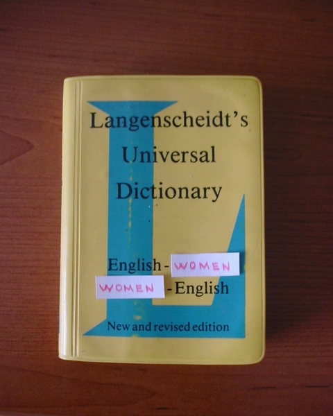
First, though a bit on the sexist side, I did see the humor in the photo. Beyond that however, I wasn't able to find much to draw me into the image. Let's dig a bit deeper:
First and foremost, the photo seems very straightforward. A photo of a book. As is, this has little impact on the viewer. You added humor to it with your slight adjustment (adding women) but didn't take it any further with other options available such as lighting, alternative focus, shadows, perspective, composition.
The colors are a bit dull but there is a nice contrast between the table wood and the mustardy color of the book. The composition is nice in its simplicity, but that also works against you because there are no other elements to keep the viewer engaged. The lighting is sufficient, but the focus while also adequate does call for a bit more sharpening. All in all, it is, in my opinion, a photograph that has average elements presented in an average way.
That said, I do think there is much that could be done with what you have. If you were inclined, I would recommend trying a couple suggestions.
First would be to add some dramatic lighting, perhaps a single shaft of light across the "English - Women, Women - English" part with the rest of the book in a bit of shadow, thus highlighting your main focal point. Perhaps have your light source shining behind something that will create an interesting pattern across the book face.
Second, perspective. This being a straight on shot, doesn't give it much flair - maybe taking it from a different angle, shifting the book itself, or something encompassing both of those lines could help add some punch.
I definitely do not want to discourage you, I think you took a solid photo in general, it just needs a little more atmosphere and a dash more creativity to give it a standout look.
Message edited by author 2003-11-25 22:58:54. |
|
Comments Made During the Challenge  |
|
|
11/18/2003 03:36:30 PM |
| Sexist but I like it! Simple idea but it works. I hope you live to receive your acclaim though . |
|
|
|
11/16/2003 01:08:07 AM |
Undoubtedly shot by a man...
Funny idea, but the photo itself is kind of boring to look at. Perhaps closer zoom and crop could have improved it a bit. It looks like the camera had hard time focusing on the cover. Some postprocessing would improve the colours of the photo. |
|
|
|
11/14/2003 03:37:06 PM |
| I can relate to this!! like the humor in it and it works to te theme |
|
|
|
11/13/2003 07:56:10 PM |
|
|
|
11/13/2003 06:51:13 PM |
| Dont know if I like the sexist joke... |
|
|
|
11/13/2003 12:18:13 PM |
| LOL. Do they are in sale? I want two. |
|
|
|
11/13/2003 04:56:35 AM |
|
|
|
11/13/2003 12:05:57 AM |
| funny, you didn't do much photographically... what about angle, lighting? |
|
|
|
11/12/2003 04:11:29 PM |
| this is a picture of a book, not an illustration/interpretation of a real book title as the challenge specified. |
|
|
|
11/12/2003 03:25:22 PM |
| Creative idea, but unfortunately doesn't make for a very appealing photo. |
|
|
|
11/12/2003 03:07:20 PM |
| LOL, this one is humorous :-))) Nice idea, and this is a woman who says that. :-) Maybe the composition and the technical makeout is too simple for me, looks like you just shot your camera - lighting and composition can be improved, for example I would have made the shot from a different angle. |
|
|
|
11/12/2003 01:27:46 PM |
| funny, but the pieces of paper are to dang obvious... What I would have done is take a photo of the cover as it is, modify the photo, print the photo and then take a photo of the photo. |
|
|
|
11/12/2003 12:51:01 PM |
| The message here must be too deep for me. The photograph itself isn't creating much visual impact. |
|
|
|
11/12/2003 12:46:32 PM |
| While somewhat funny, it's just a picture of a book... |
|
|
|
11/12/2003 11:22:51 AM |
| The joke was good! The photo no so well. |
|
|
|
11/12/2003 04:04:53 AM |
| A bit sharper would have made it look better. 6 |
|
Home -
Challenges -
Community -
League -
Photos -
Cameras -
Lenses -
Learn -
Help -
Terms of Use -
Privacy -
Top ^
DPChallenge, and website content and design, Copyright © 2001-2026 Challenging Technologies, LLC.
All digital photo copyrights belong to the photographers and may not be used without permission.
Current Server Time: 02/01/2026 09:02:44 AM EST.