| Author | Thread |
|
|
11/20/2003 06:08:23 PM |
From the Critique Club
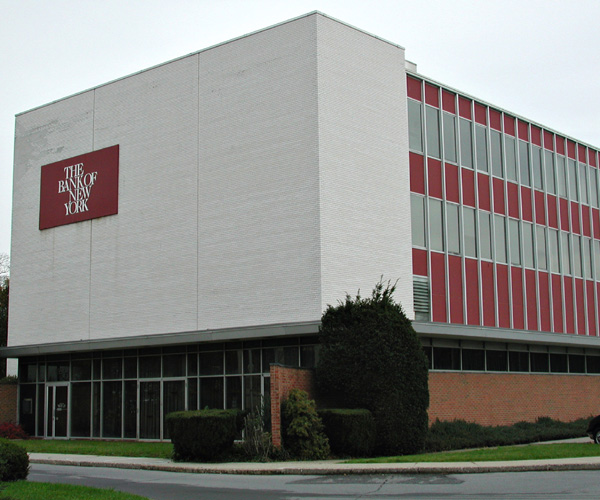
This shot was definately one of the more original for the Sacred Places challenge and makes a valid statement.
Unfortunately it is not a very interesting shot on it's own merit. As banks go, this one just ain't all that interesting to look at.
The colors are quite dull and there is not much detail in the bushes making me believe that there was a problem with inadequate lighting. Taking the shot during a different time of day may help with this. Also if you play around with saturation and levels in photoshop or a similar program you may be able to improve the color issues.
There is also a perspective problem that occurs frequently with lower end cameras like yours and mine. If you could take the same shot from a higher vantage point so that the camera is not tilted up this will help the perspective look more natural.
When scoring a challenge I always give bonus points for originality and I did with this shot also! Very good concept, just needs a better subject to pull it off.
TC |
|
 Photographer found comment helpful. Photographer found comment helpful. |
Comments Made During the Challenge  |
|
|
11/15/2003 08:47:41 AM |
| Seems off level, not enought to be intentional, but enough to be distracting. I do like the building. |
|
|
|
11/14/2003 09:52:42 PM |
| Oh, so synical. A more creative perspective would have had more impact, and better light would have helped. |
|
|
|
11/13/2003 04:34:12 AM |
| Certainly not to me! ;) Nice take on the challenge but the shot itself leaves me wanting, from the look of the sky behind it was a very sunny day and I think more light would have really made this shot pop, the red on the side looks dull to me. The overall composition of the is well done, I like the cropping though it looks just a tad crooked. I started with a 4 on this but am bumping it to a 5 :) |
|
| Photographer found comment helpful. |
|
|
11/12/2003 02:02:02 PM |
| I like how you've used colors and tones to build a sacred mood for this ironic shot. |
|
| Photographer found comment helpful. |
|
|
11/12/2003 10:20:41 AM |
| A very literal depiction, without much of anything to provide interest. THe subject isn't very visually exciting in the first place, though the widows and red panels could maybe be an interesting subject if photographed appropriately. 2 |
|
| Photographer found comment helpful. |
|
|
11/12/2003 07:59:38 AM |
| Fantastic shot.. all too true though. |
|
| Photographer found comment helpful. |
|
|
11/12/2003 05:30:15 AM |
| so true. The colours are a bit flat and I would suggest a bit more negative space at least at the top to give more interest to the shot. 5 |
|
| Photographer found comment helpful. |
|
|
11/11/2003 07:12:47 PM |
| A clever idea but the light was very flat that day. I think you could have maybe found more interesting bank architecture and made a more dynamic picture. this one's a box. |
|
| Photographer found comment helpful. |
|
|
11/11/2003 02:42:02 PM |
| amen brother or sister! good title sort of a dull shot though ... 6 |
|
| Photographer found comment helpful. |
|
|
11/10/2003 03:03:36 PM |
|
| Photographer found comment helpful. |
|
|
11/10/2003 01:35:58 PM |
| funny - I wish you'd tried a more dramatic angle - like from below with the Bank of NY sign soaring into the sky like a church spire - would be even funnier. |
|
| Photographer found comment helpful. |
|
|
11/10/2003 08:12:05 AM |
| Couldn't agree more with your sentiment, but the photo is a little dull. A touch of sunshine would have helped, but increased contrast and saturation might also help. |
|
| Photographer found comment helpful. |
Home -
Challenges -
Community -
League -
Photos -
Cameras -
Lenses -
Learn -
Help -
Terms of Use -
Privacy -
Top ^
DPChallenge, and website content and design, Copyright © 2001-2025 Challenging Technologies, LLC.
All digital photo copyrights belong to the photographers and may not be used without permission.
Current Server Time: 04/07/2025 05:57:33 AM EDT.