| Author | Thread |
|
|
03/18/2009 04:53:30 PM |
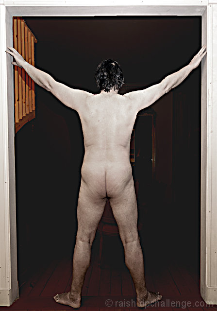
I think it would be neat if you tried this again with a neutral beige background, then pushed it to B&W and changed the colour to be a desaturated skintone... sepia like. I'm not entirely sure of the Leonardo Da Vinci Vitruvian Man, but I think the key was keeping the arms and the legs an equal distance apart.
There's nothing wrong with your body... it reflects the body of a man your age. This was a great attempt. Seriously, try it again! |
|
 Photographer found comment helpful. Photographer found comment helpful. |
Comments Made During the Challenge  |
|
|
02/04/2007 06:54:39 PM |
|
| Photographer found comment helpful. |
|
|
02/04/2007 06:54:12 PM |
|
| Photographer found comment helpful. |
|
|
02/04/2007 06:27:11 PM |
|
| Photographer found comment helpful. |
|
|
02/04/2007 12:38:09 PM |
| I don't like the post processing on this, the added haze doens't quite work for me. I think that's the greatest issue with the image. Good luck |
|
| Photographer found comment helpful. |
|
|
02/04/2007 11:37:38 AM |
| Interesting idea. But the execution needs work. The doorframe detracts and you could use more light on the lower body, or less light on the upper body. |
|
| Photographer found comment helpful. |
|
|
02/04/2007 04:51:44 AM |
| nice idea but the processing leaves a bit to be desired. |
|
| Photographer found comment helpful. |
|
|
02/01/2007 03:24:02 PM |
| The lighting on this is very harsh and the pose uninteresting. I'm assuming (based on your title) that you are doing a parallel to Leonard Da Vinci's "Vitruvian Man". The only thing that leads the viewer to this conclusion is the title. The background totally removes any indication of what you are attempting. Perhaps if this was shot on a white background and done in a high key nature and then toned down in post-processing with some sepia tones, you could better achieve your vision. |
|
| Photographer found comment helpful. |
|
|
02/01/2007 09:44:32 AM |
| I really don't get your editing here! It just doesn't suit the overall image at all (just my humble opinion) |
|
| Photographer found comment helpful. |
|
|
01/31/2007 04:50:37 PM |
| hahaha this so sour man.. love it |
|
| Photographer found comment helpful. |
|
|
01/31/2007 03:31:20 PM |
|
| Photographer found comment helpful. |
|
|
01/31/2007 01:50:44 AM |
| hmmm, cant adjust in the theme |
|
| Photographer found comment helpful. |
|
|
01/31/2007 12:32:53 AM |
| the color processing hurts this image. the colored areas attract distract from the main subject |
|
| Photographer found comment helpful. |
|
|
01/30/2007 04:35:22 PM |
DiCaprio or DiVinci? LOL!
I'm really reaching to find something in this shot that doesn't make me see an older man "flashing" a room. |
|
| Photographer found comment helpful. |
|
|
01/30/2007 08:35:01 AM |
| Post processing is a bit overdone. |
|
| Photographer found comment helpful. |
|
|
01/29/2007 10:03:43 PM |
| This is a good idea. Would probably be more effective and a stronger presentation if you used like a black sheet or something for a solid plain background, and not have the doorframe and other elements. |
|
| Photographer found comment helpful. |
|
|
01/29/2007 04:26:59 PM |
| i don't care for the processing on this .. |
|
| Photographer found comment helpful. |
|
|
01/29/2007 10:40:34 AM |
| I think one of the biggest problems with this picture is the lighting. The on camera flash creates a very flat and uninteresting image. A more directional side lighting could be used to add more mood to the picture. The background also doesn't add to the image. |
|
| Photographer found comment helpful. |
|
|
01/29/2007 10:29:02 AM |
| Not that I recognize the bum but are you by any chance a poet? Funny idear ;-) |
|
| Photographer found comment helpful. |
|
|
01/29/2007 09:06:51 AM |
| I think that chair in front of the model is a little distracting... |
|
| Photographer found comment helpful. |
|
|
01/29/2007 09:02:08 AM |
| the background looks pretty distracting, I think I'd rather see this in a studio-environment (black background). It also looks like you desaturated the body, not sure if I like that (ofcourse I don't know the original file :)) |
|
| Photographer found comment helpful. |
|
|
01/29/2007 08:59:38 AM |
| For some reason this makes me think of Monty Python... and the title is a hoot. |
|
| Photographer found comment helpful. |
|
|
01/29/2007 08:39:34 AM |
| I agree - it was different for Leonardo. As this is advanced editing I would have lost everything in the room beyond the door. |
|
| Photographer found comment helpful. |
|
|
01/28/2007 10:42:07 PM |
| all you need is the fountain!!!!! 8 |
|
| Photographer found comment helpful. |
|
|
01/28/2007 07:45:15 PM |
|
| Photographer found comment helpful. |
|
|
01/28/2007 07:31:24 PM |
|
| Photographer found comment helpful. |
|
|
01/28/2007 07:14:52 PM |
| There are many great works of art that feature less-than-perfect bodies. This, alas, is not one of them. |
|
| Photographer found comment helpful. |
Home -
Challenges -
Community -
League -
Photos -
Cameras -
Lenses -
Learn -
Help -
Terms of Use -
Privacy -
Top ^
DPChallenge, and website content and design, Copyright © 2001-2025 Challenging Technologies, LLC.
All digital photo copyrights belong to the photographers and may not be used without permission.
Current Server Time: 04/07/2025 05:56:05 AM EDT.