| Author | Thread |
Comments Made During the Challenge  |
|
|
02/01/2007 05:09:11 PM |
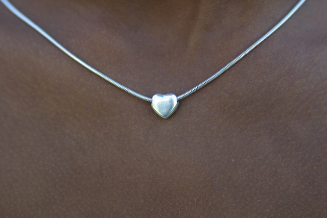
| Some very nice fill-the-frame minimalism here! So much is conveyed about who she is from the most minimal view possible, exactly what Minimalism is all about. 9 |
|
 Photographer found comment helpful. Photographer found comment helpful. |
|
|
01/30/2007 12:31:23 PM |
| well centered... bit dull... |
|
| Photographer found comment helpful. |
|
|
01/29/2007 10:19:05 PM |
| Normally a centered subject is frowned upon but the centered heart works here with the arc of the necklace giving a good dynamic element and just the hint of the neck giving the perspective. Nice job. |
|
| Photographer found comment helpful. |
|
|
01/27/2007 11:20:50 AM |
| Really good idea, but needs to be more in focus. |
|
| Photographer found comment helpful. |
|
|
01/27/2007 05:48:27 AM |
| Interesting idea, but the composition isn't very interesting, and it needed a bit more sharpness and clarity to really be striking. |
|
| Photographer found comment helpful. |
|
|
01/26/2007 09:24:45 AM |
| Nice. Might be a little more pleasing with the necklace coming off the corners and the heart at the lower portion. Good Luck. |
|
| Photographer found comment helpful. |
|
|
01/26/2007 06:04:50 AM |
|
| Photographer found comment helpful. |
|
|
01/26/2007 01:57:24 AM |
|
| Photographer found comment helpful. |
|
|
01/26/2007 12:12:16 AM |
| skin tones don't look natural, DOF is too shallow, lighting is flat |
|
| Photographer found comment helpful. |
|
|
01/25/2007 11:44:30 PM |
| there are three things that aren't good in this photo. the simetry isn't perfect, I think that the composition was good if both the upper corners was filled. the colours are flat and the focus isn't perfect |
|
| Photographer found comment helpful. |
|
|
01/25/2007 07:39:08 PM |
|
| Photographer found comment helpful. |
Home -
Challenges -
Community -
League -
Photos -
Cameras -
Lenses -
Learn -
Help -
Terms of Use -
Privacy -
Top ^
DPChallenge, and website content and design, Copyright © 2001-2025 Challenging Technologies, LLC.
All digital photo copyrights belong to the photographers and may not be used without permission.
Current Server Time: 04/08/2025 04:48:50 AM EDT.