| Author | Thread |
|
|
02/13/2007 12:37:37 AM |
| how the hell did you make this look good..... |
|
 Photographer found comment helpful. Photographer found comment helpful. |
|
|
02/01/2007 09:11:43 PM |
| Even w/o the title, I "understand" the split screen if you will. I can appreciate the exposure control here. |
|
| Photographer found comment helpful. |
|
|
02/01/2007 07:21:22 PM |
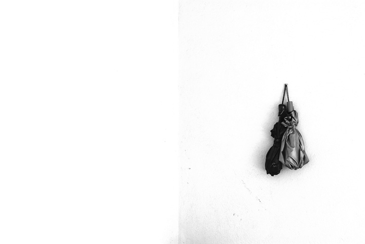
The right half of the photo is lovely. The left half, IMO, serves no purpose. :( Perhaps I'm missing something, I'd like to hear what the author wanted to do here.
Edit to add: Came back to look one more time twenty minutes later, and the photo's title, finally, kicked in for me. I'm blushing. Forget what I said above. :) Great work.
Message edited by author 2007-02-02 00:48:51. |
|
| Photographer found comment helpful. |
Comments Made During the Challenge  |
|
|
02/01/2007 05:16:18 PM |
| I love it. and done in camera, too! nice. 9 |
|
| Photographer found comment helpful. |
|
|
02/01/2007 07:49:10 AM |
| what happened to the background - 1/2 looks dirty/grainy |
|
| Photographer found comment helpful. |
|
|
01/28/2007 02:26:37 AM |
| Interesting approach, but it doesn't really do much for me, especially with the "extra" shadow at the bottom center and the scattered extra marks. Still, looks better on second look than it did on first (I vote before I comment), so a bump up is warranted. |
|
| Photographer found comment helpful. |
|
|
01/26/2007 10:14:28 AM |
| Simplistic, not a fan of white backgrounds |
|
| Photographer found comment helpful. |
|
|
01/25/2007 10:59:39 PM |
| Ah, is it "card" due to the vertical line type thingie? Interesting concept if so. |
|
| Photographer found comment helpful. |
Home -
Challenges -
Community -
League -
Photos -
Cameras -
Lenses -
Learn -
Help -
Terms of Use -
Privacy -
Top ^
DPChallenge, and website content and design, Copyright © 2001-2025 Challenging Technologies, LLC.
All digital photo copyrights belong to the photographers and may not be used without permission.
Current Server Time: 04/07/2025 01:53:12 PM EDT.