| Author | Thread |
Comments Made During the Challenge  |
|
|
03/31/2002 07:55:00 AM |
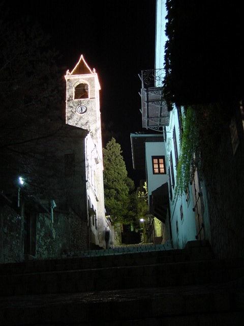
| the composition is skewed, but not enough to be dramatic; the color and light on the right are beautiful; on the left, washed out |
|
|
|
03/31/2002 01:20:00 AM |
| Great shot. I might have moved left to hide the illuminated face of the building on the left, to make the clock tower look as though it was rising out of nothing. |
|
|
|
03/30/2002 06:37:00 PM |
|
|
|
03/29/2002 06:38:00 AM |
|
|
|
03/28/2002 12:15:00 PM |
|
|
|
03/28/2002 10:11:00 AM |
|
|
|
03/28/2002 08:41:00 AM |
| Wow! I like the lighting in this one. |
|
|
|
03/27/2002 07:20:00 AM |
| I wish this weren't tilted to the left! |
|
|
|
03/27/2002 05:58:00 AM |
| i wish you were closer to the clock tower ... |
|
|
|
03/26/2002 05:07:00 AM |
| Ominus, and nice dark area around the outside of the image. |
|
|
|
03/25/2002 08:46:00 AM |
| Great technique and color. |
|
|
|
03/25/2002 07:54:00 AM |
| This is just beautiful. Colors are great and the architecture is fabulous. |
|
|
|
03/25/2002 04:56:00 AM |
| Nice photo! I wonder what the clock tower would have looked like a little closer up though? |
|
|
|
03/24/2002 07:29:00 PM |
| This would get my eye more if you were closer in on the tower and had less excess at the bottom. |
|
Home -
Challenges -
Community -
League -
Photos -
Cameras -
Lenses -
Learn -
Help -
Terms of Use -
Privacy -
Top ^
DPChallenge, and website content and design, Copyright © 2001-2025 Challenging Technologies, LLC.
All digital photo copyrights belong to the photographers and may not be used without permission.
Current Server Time: 04/07/2025 12:07:09 AM EDT.