| Author | Thread |
|
|
11/12/2003 10:15:53 AM |
Originally posted by moodville:
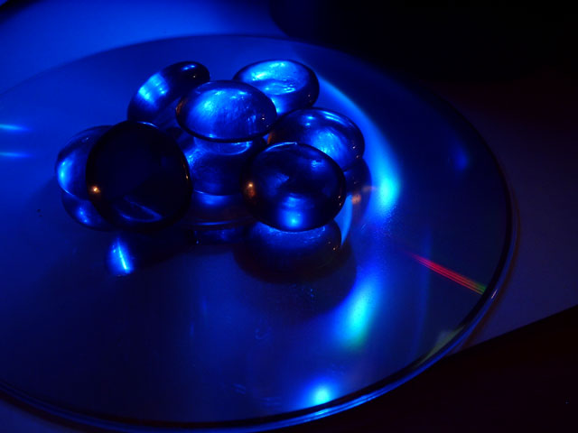
I get the feeling of low light focus problems, probably not helped much by the reflective surface of what I assume is a CD. I do like the way the glass beads handle the light, although the front left bead/chip is a little dark and could probably have done with being moved a little so the light could shine through it like the others. I gave this a 5 while voting. Clearly thought and time was put into the image, but I felt like there were some technical aspects that needed improving. |
There were indeed focus problems. My digicam's infamous for not being able to focus in low lighting. I left the front/left bead dark to give the image a little variety. Thanks for your great advice. |
|
|
|
11/12/2003 10:05:13 AM |
| Perhaps your entry did a little less than it deserved because cd's have been used a lot in past challenges, and in some minds at least, are approaching cliche status. I would have liked a little crisper focus. The marks on the cd in front of the beads, the red line, the black dot mid left are distracting. I gave it a 5. |
|
 Photographer found comment helpful. Photographer found comment helpful. |
|
|
11/12/2003 10:00:27 AM |
| I gave your shot an 8 when I voted on it. I love your use of color and light, and I don't mind the red streak off to the right, but the yellowish reflections were a bit distracting. Good job, overall. :) |
|
| Photographer found comment helpful. |
|
|
11/12/2003 09:46:53 AM |
| The first thing I notice that I do not really care for are the red streaks. The composition is a little haphazard with the black areas. As the whole thing has a blue theme going I think it would have been beneficial to keep a consistent (or slightly gradient) blue background. I get the feeling of low light focus problems, probably not helped much by the reflective surface of what I assume is a CD. Along with the red streaks, the light flares on the right are a little distracting. I do like the way the glass beads handle the light, although the front left bead/chip is a little dark and could probably have done with being moved a little so the light could shine through it like the others. I gave this a 5 while voting. Clearly thought and time was put into the image, but I felt like there were some technical aspects that needed improving. |
|
| Photographer found comment helpful. |
Home -
Challenges -
Community -
League -
Photos -
Cameras -
Lenses -
Learn -
Help -
Terms of Use -
Privacy -
Top ^
DPChallenge, and website content and design, Copyright © 2001-2026 Challenging Technologies, LLC.
All digital photo copyrights belong to the photographers and may not be used without permission.
Current Server Time: 02/01/2026 11:10:23 AM EST.