| Author | Thread |
Comments Made During the Challenge  |
|
|
01/16/2007 05:43:17 PM |
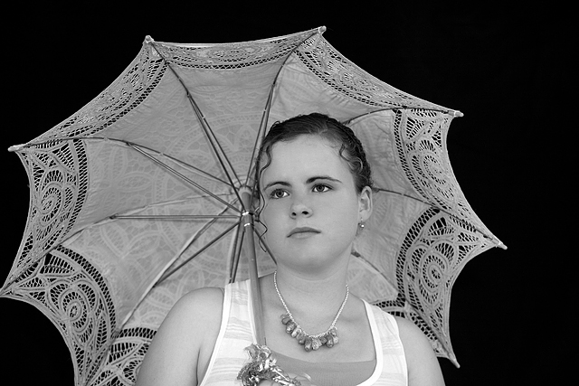
| Sorry I like the slightly "high-key" entry better, it has an edge that this image doesn't have. Still the focus and model are extraordinary. 8 |
|
 Photographer found comment helpful. Photographer found comment helpful. |
|
|
01/16/2007 05:20:53 PM |
|
| Photographer found comment helpful. |
|
|
01/15/2007 08:13:37 PM |
|
| Photographer found comment helpful. |
|
|
01/14/2007 03:30:43 PM |
|
| Photographer found comment helpful. |
|
|
01/13/2007 09:54:26 PM |
| is it just me or is this girl in here twice? the other pose is more flattering, and this still needs to be cropped tighter IMO |
|
| Photographer found comment helpful. |
|
|
01/12/2007 07:19:48 PM |
| Technically, this photo is very well done. I have gone back to this one many times because I like it, but there is something about it that detracts. I think looking at it again, that the umbrella kind of steals the show. Not to say your grandaughter isn't beautiful (she is very much so)but the lace against the black draws my eyes away from her. Maybe a portrait crop with one side of the umbrella cut off would have helped. Hope you're not offended, I was just offering my 2 cents. I still think it's a very fine portrait. |
|
| Photographer found comment helpful. |
|
|
01/12/2007 02:43:57 PM |
|
| Photographer found comment helpful. |
|
|
01/12/2007 07:27:58 AM |
|
| Photographer found comment helpful. |
|
|
01/11/2007 11:19:26 AM |
| Nice crisp focus. Might have been more effective if she were looking at the camera, as I find my eye wondering all around the shot (6) |
|
| Photographer found comment helpful. |
|
|
01/11/2007 09:32:03 AM |
| Wow, are 2 of you taking pictures of the same model for this contest????? Same family of photographers? Swore one of the other entries was of the same model? |
|
| Photographer found comment helpful. |
|
|
01/11/2007 08:35:44 AM |
This is the same girl as pictured in "Hope" here:
//www.dpchallenge.com/challenge_vote_image.php?IMAGE_ID=450602
Is this allowed??? |
|
| Photographer found comment helpful. |
|
|
01/10/2007 11:54:30 AM |
Ok, there is a raging debte about people's voting habits at the moment, so i will attempt to give a detailed comment with my vote:
Sharp. Good focus. Composition is not super interesting. I would have given it it a tighter crop. All in all, good quality image. Doesn't stand out but it's a quality shot. 7 |
|
| Photographer found comment helpful. |
|
|
01/10/2007 09:19:50 AM |
I like the whole idea. The umbrella works well with the lady. But technically the composition is wrong and i feel it in the end result.. meaning: she looks to the left, you have the umbrella leaning to the left, yet you give no place to either of them. You have so much space to the right, why not move your granddaughter up to the right and as such give more space to the look, as well to the umbrella which is presently cut off.
The lighting is spot on.. very nicely toned.
I get the impression you really searched and found the right person for this challenge. Just that small detail of composition.. vote=6 |
|
| Photographer found comment helpful. |
Home -
Challenges -
Community -
League -
Photos -
Cameras -
Lenses -
Learn -
Help -
Terms of Use -
Privacy -
Top ^
DPChallenge, and website content and design, Copyright © 2001-2025 Challenging Technologies, LLC.
All digital photo copyrights belong to the photographers and may not be used without permission.
Current Server Time: 04/09/2025 07:41:39 PM EDT.