| Author | Thread |
|
|
07/19/2004 07:10:56 PM |
Your 'number 8' entry came in 8th and your 'number 4' entry came in 4th!
You should start composing Number 1s for every challenge!
=P
Great idea, btw. |
|
 Photographer found comment helpful. Photographer found comment helpful. |
Comments Made During the Challenge  |
|
|
11/09/2003 11:44:32 PM |
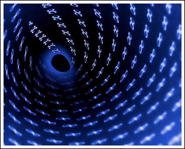
| Great concept! Too bad the compression artifacts looks like they took a toll on this image (looking at the right lower front and around the "hole" at the end of the tunnel). But don't get me wrong -- I like it! |
|
| Photographer found comment helpful. |
|
|
11/09/2003 07:26:45 PM |
| Wonderful color! The hole also adds an interesting dimension. My top pick for this challenge. |
|
| Photographer found comment helpful. |
|
|
11/09/2003 09:57:30 AM |
| interesting way of giving the eye motion to follow, good color meets challenge 8 |
|
| Photographer found comment helpful. |
|
|
11/09/2003 02:36:37 AM |
| Clever. And effective. I love the varied tones as we move toward that hole. 9 |
|
| Photographer found comment helpful. |
|
|
11/08/2003 09:30:41 PM |
| infinity and no.8...... :D |
|
| Photographer found comment helpful. |
|
|
11/08/2003 11:48:26 AM |
| Unfortunately, it looks more like a hole 8's because of the posiiton of the infinity symbol at the center. The center is also pixelated. Nice negative and coloring though. |
|
| Photographer found comment helpful. |
|
|
11/07/2003 11:50:08 AM |
| Looks a little noisy. Chromatics too maybe? |
|
| Photographer found comment helpful. |
|
|
11/06/2003 11:06:49 PM |
|
| Photographer found comment helpful. |
|
|
11/06/2003 08:03:00 AM |
| Cool idea. Really creative! At first I thought you did this with a computer, then I saw where they overlap. This would have been a fine contender if it was cleaned up a bit. The hole is really jaggy and the edges of the picture are really noisy. Did you try getting the hole more round? |
|
| Photographer found comment helpful. |
|
|
11/05/2003 12:07:13 AM |
| Interesting lighting here - obvious symbolism, but very original display and composition! |
|
| Photographer found comment helpful. |
|
|
11/04/2003 07:38:26 PM |
| Oooooohhh.... My first 10. I like it a lot. Depth of field is good, Colors are very nice, gives a space-like effect to it. I also like the Escher-esque change from an 8 to the infinity symbol. good job |
|
| Photographer found comment helpful. |
|
|
11/04/2003 06:15:24 PM |
| Nice idea. Great color. I gave it a 7. |
|
| Photographer found comment helpful. |
|
|
11/04/2003 05:39:18 PM |
| Nice idea. I like the bright blue tones. Good composition and lighting. 9. |
|
| Photographer found comment helpful. |
|
|
11/04/2003 02:44:35 PM |
| Nice abstract quality, with a composition that does sort of draw you in. Not crazy about the border, it keeps drawing my eyes away from the photograph. |
|
| Photographer found comment helpful. |
|
|
11/04/2003 10:37:03 AM |
| Great concept and use of color. |
|
| Photographer found comment helpful. |
|
|
11/03/2003 03:30:31 PM |
|
| Photographer found comment helpful. |
|
|
11/03/2003 08:57:05 AM |
| this fuckin rocks hardcore dude. the colors and dof and movement - all first class. only niggle: the hole at the end might be better if it was a more perfect circle. nonetheless, a solid 10. |
|
| Photographer found comment helpful. |
|
|
11/03/2003 08:13:28 AM |
Excellent. wonderful. great. bravooooooooo.. Good luck.
Regards, BIliana |
|
| Photographer found comment helpful. |
|
|
11/03/2003 06:39:21 AM |
| The clearest infinity signs look like 8s... it would have been good to change the orientation. I've seen this shot carried out much better in another challenge unfortunately, so you don't get the originality point in your score. Shame about the noise levels in the shot. 5 |
|
| Photographer found comment helpful. |
|
|
11/03/2003 03:03:31 AM |
| Clever concept and excellent photo. The blue lighting on the symbols is particularly effective. Great stuff. |
|
| Photographer found comment helpful. |
|
|
11/03/2003 02:19:49 AM |
| Would have been better if the focus was on the infinite signs and not the 8's huh? Just Kidding! This is very nice. I must remember to try this technique. |
|
| Photographer found comment helpful. |
Home -
Challenges -
Community -
League -
Photos -
Cameras -
Lenses -
Learn -
Help -
Terms of Use -
Privacy -
Top ^
DPChallenge, and website content and design, Copyright © 2001-2026 Challenging Technologies, LLC.
All digital photo copyrights belong to the photographers and may not be used without permission.
Current Server Time: 02/01/2026 08:09:16 AM EST.