| Author | Thread |
Comments Made During the Challenge  |
|
|
01/11/2007 02:25:24 PM |
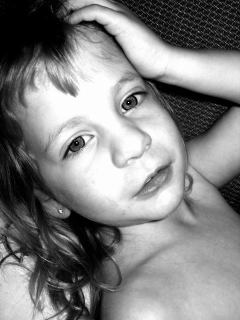
| I like the eye contact. There are too many blown out areas on her face, which I find a bit distrating. |
|
 Photographer found comment helpful. Photographer found comment helpful. |
|
|
01/11/2007 07:52:39 AM |
| Not the best lighting - highlights are burnt out |
|
|
|
01/10/2007 08:09:10 PM |
| The highlights are way blown out. |
|
|
|
01/10/2007 07:39:33 PM |
| eyes perfect, skin blown out |
|
|
|
01/10/2007 09:16:05 AM |
| Harsh lighting and over exposed face. |
|
|
|
01/10/2007 07:13:03 AM |
| Hot spots on the face are a distraction |
|
|
|
01/10/2007 03:17:34 AM |
| too much light on the face... pretty little girl |
|
|
|
01/10/2007 03:09:43 AM |
| It appears that the light was too strong, or the contrast was bumped too much in post... the light on the front of the face is blown out (i.e. there is no detail left in the nose, the cheek, the forehead). Contrast that with how much detail is on her shoulders and chest and you can see the it's been blown. This was probably caused by having the light source too close to her head. Very close. Since light diminishes with the square of the distance, it would have to be very close in order to be too strong on the face, which is only inches higher than her chest. |
|
| Photographer found comment helpful. |
|
|
01/09/2007 11:20:47 PM |
| I think the eyes are overprocessed... IMHO. Nice model though |
|
| Photographer found comment helpful. |
|
|
01/09/2007 08:20:59 PM |
| the highlights are blown out in the lighting which is quite harsh |
|
| Photographer found comment helpful. |
Home -
Challenges -
Community -
League -
Photos -
Cameras -
Lenses -
Learn -
Help -
Terms of Use -
Privacy -
Top ^
DPChallenge, and website content and design, Copyright © 2001-2025 Challenging Technologies, LLC.
All digital photo copyrights belong to the photographers and may not be used without permission.
Current Server Time: 04/08/2025 01:47:16 AM EDT.