| Author | Thread |
Comments Made During the Challenge  |
|
|
01/25/2007 04:01:36 PM |
| so glad you chose this photo!!! Its already in my favs, (or atleast I hope it returns :)) I hope this does well for you, definite ten from me! |
|
|
|
01/24/2007 11:23:37 PM |
| DNMC. No... I'm kidding. Simple composition and lighting makes for quite a nice image. |
|
|
|
01/24/2007 09:00:44 PM |
|
|
|
01/24/2007 05:20:06 PM |
"simple is as simple does,
no sense chasing what once was"
©skip rowland '85
lovely image, btw |
|
|
|
01/23/2007 09:36:49 AM |
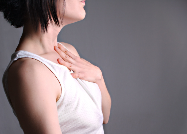
| Effective. I like that not having her face yields so many more "story" opportunities. |
|
|
|
01/22/2007 10:02:47 PM |
| Love the crop!!! Very simple, and effective, composition. |
|
|
|
01/20/2007 05:59:41 PM |
| love the lighting, love the crop. |
|
|
|
01/19/2007 07:38:58 PM |
| An unusual crop but it really works well for this one. |
|
|
|
01/19/2007 10:06:51 AM |
| hmm you remember me someone... Good luck ;) love the lighting and the texture of the skin. |
|
|
|
01/17/2007 09:11:18 PM |
Good choice for best of Lorrie.
An unconventional crop, but works well to set the mood & story. |
|
|
|
01/16/2007 07:33:59 AM |
| not sure what the message is here. Maybe there is none. Title indcates that there is. |
|
|
|
01/16/2007 04:37:12 AM |
| hmm, nothing pulls me on this photo ... sorry |
|
|
|
01/15/2007 01:03:02 AM |
| I like as well simple pictures 10 |
|
|
|
01/14/2007 10:48:31 AM |
| hope you've done a whole series of this, excellent work, should be hanging in a gallery 10! |
|
|
|
01/13/2007 09:53:17 AM |
| I like the concept and pose, but wish I could see just a bit more face (at least the whole mouth). Also, the contrast is a little to much, causing banding on her right arm and highlights just about blown. |
|
|
|
01/13/2007 05:34:52 AM |
| I keep trying to scroll up to see her face. I think the crop is too tight. |
|
|
|
01/13/2007 03:10:12 AM |
| A really different and interesting composition, but I'm not sure about the background. Somehow it doesn't fit. But thats just me. Good luck in the challenge! (7) |
|
|
|
01/12/2007 03:29:42 PM |
| I love the simplicity...wish you saved this at 720 px and not 630...7 |
|
|
|
01/12/2007 02:43:27 PM |
| The shirt is a little blown in the highlight region |
|
|
|
01/12/2007 03:03:57 AM |
|
Home -
Challenges -
Community -
League -
Photos -
Cameras -
Lenses -
Learn -
Help -
Terms of Use -
Privacy -
Top ^
DPChallenge, and website content and design, Copyright © 2001-2025 Challenging Technologies, LLC.
All digital photo copyrights belong to the photographers and may not be used without permission.
Current Server Time: 04/08/2025 04:29:27 PM EDT.