| Author | Thread |
|
|
01/11/2007 10:57:52 AM |
| I didn't vote on this challenge but did participate. I think you're too deep here and got penalized for it. Dpc voters tend to be VERY literal when it comes to challenges. Good try ! I would have given it a 7-8. |
|
 Photographer found comment helpful. Photographer found comment helpful. |
|
|
01/08/2007 08:17:11 AM |
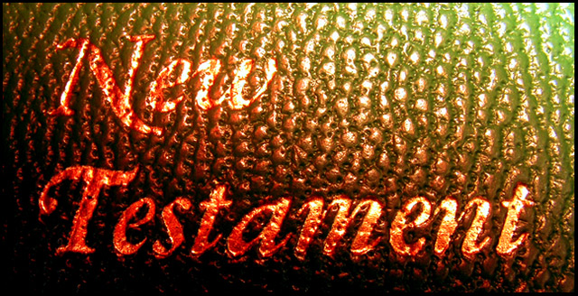
Whoa, a brown ribbon with a shot of the Bible. This deserves an OOBIE for sure.
I am a little bothered by not being able to read the word 'New' easily. I'd be curious to see what would happen if you used Gradient Map on this image to achieve the colors. |
|
| Photographer found comment helpful. |
Comments Made During the Challenge  |
|
|
01/07/2007 06:45:37 PM |
| I'm not familiar with that connection, but it's not an especially good exposure anyway. |
|
| Photographer found comment helpful. |
|
|
01/07/2007 12:17:03 PM |
| Admittedly, I'm not that familiar with the new testament, but this seems like using the title so shoehorn the photo into the challenge. The glare on the 'w' is also very distracting and though I assume you were going for red and green as Christmas colors, they wind up looking kindof muddy. |
|
| Photographer found comment helpful. |
|
|
01/06/2007 01:17:13 PM |
| Common, you can do better than that. I find it very unoriginal to just photograph a cover of a book! |
|
| Photographer found comment helpful. |
|
|
01/04/2007 12:40:05 PM |
| Just wanted to explain myself...I gave you a 3. I don't have a problem with the symbolism, just the picture. I find the subject uninteresting as presented, and the lighting and colors are very harsh. I think it was a good idea, but got lost in the execution. |
|
| Photographer found comment helpful. |
|
|
01/04/2007 04:59:22 AM |
| I like the colors, but the lower left is a bit dark. Overall not much to keep my attention. |
|
| Photographer found comment helpful. |
|
|
01/04/2007 02:53:34 AM |
an interesting interpretation. however, a slightly more subtle treatment might have worked better. i'm visualising a bible open on a glass table, and the pic shot from underneath, so you can get the shape of the 'bird' and the title.
the lighting here is nteresting, withthe red and green for christmas, i'm assuming. however, the very blown highlights really take away from the image, as do the very dark shadows, making the text hard to read. and, as the text is the subject, this is a drawback!
so, a good start, and keep shooting! |
|
| Photographer found comment helpful. |
|
|
01/03/2007 10:01:27 PM |
| I want to be nice but... no sorry |
|
| Photographer found comment helpful. |
|
|
01/03/2007 05:42:20 PM |
| if you have to explain your photo with that many words, it probably is not that great of an 'image' |
|
| Photographer found comment helpful. |
|
|
01/03/2007 01:49:32 AM |
| This needed to be lit a little differently I think, the gleam on the book itself doesn't really do much in combo with the golden letters. |
|
| Photographer found comment helpful. |
|
|
01/02/2007 11:10:15 AM |
I guess the dodgy "obscured catechism mnemonic" interpretation of the song was bound to crop up.
If you are going to go down that path, I would be looking for the connection being made in the image itself, rather than being nailed to my forehead in the title. When all is said and done, this is just a close-up of a book cover. Sorry if that sounds harsh. |
|
| Photographer found comment helpful. |
|
|
01/01/2007 05:32:34 AM |
| sorry ... doesn't work for me ... the lighting is also not very good ... |
|
| Photographer found comment helpful. |
|
|
01/01/2007 01:49:07 AM |
| A different angle on the challenge. |
|
| Photographer found comment helpful. |
|
|
01/01/2007 12:18:44 AM |
| Ok, not being a religous person I don't know that that means. Regardless, the photo is harsh and hard to look at. |
|
| Photographer found comment helpful. |
|
|
12/31/2006 11:22:30 PM |
| EXCELLENT IT REALLY IS A GREAT IMAGE 9 |
|
| Photographer found comment helpful. |
Home -
Challenges -
Community -
League -
Photos -
Cameras -
Lenses -
Learn -
Help -
Terms of Use -
Privacy -
Top ^
DPChallenge, and website content and design, Copyright © 2001-2025 Challenging Technologies, LLC.
All digital photo copyrights belong to the photographers and may not be used without permission.
Current Server Time: 04/07/2025 02:01:32 PM EDT.