| Author | Thread |
|
|
01/15/2007 06:40:56 AM |
I like both. I don't see the lavender cast that Pedro mentions on this Mac monitor.
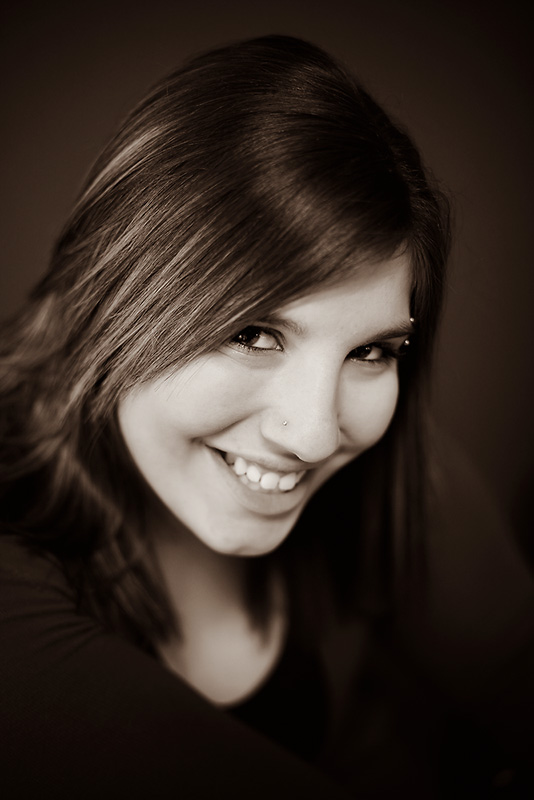
The only things I see to do would be crop the bottom a bit if it fits the printers format, and maybe brighten up the one tooth that is in the shadow of her smile just a little. The printer may do a better job with the toned one. Shallow DOF is ok with me as it accents the pixie eyes above the dimple in the chin.
I am just a casual observer in the studio field, as it is not my field of experience, so this is just my unqualified opinion. |
|
 Photographer found comment helpful. Photographer found comment helpful. |
|
|
01/15/2007 06:10:47 AM |
this looks very similar to the quad that i usually use...not sure if it's just me/my monitor but it has a slight lavender cast to the skin. Ken Lee authored a couple of quads - one of which has a lavender bent to it - that looks a lot like this. i find it better for inanimates, and tend to go with a more earthy tone for faces.
very unusual to hear me say this, but i'm with you - I prefer the colour; it seems richer and more full of life.
for whatever it's worth, that's my opinion :)
P |
|
| Photographer found comment helpful. |
|
|
01/06/2007 04:56:12 AM |
| I would go with the toning, it is just a little cleaner, allows the viewer to focus on Michelle rather than be distracted by the colors. |
|
| Photographer found comment helpful. |
Home -
Challenges -
Community -
League -
Photos -
Cameras -
Lenses -
Learn -
Help -
Terms of Use -
Privacy -
Top ^
DPChallenge, and website content and design, Copyright © 2001-2025 Challenging Technologies, LLC.
All digital photo copyrights belong to the photographers and may not be used without permission.
Current Server Time: 04/08/2025 05:02:17 AM EDT.