| Author | Thread |
Comments Made During the Challenge  |
|
|
01/02/2007 06:44:30 PM |
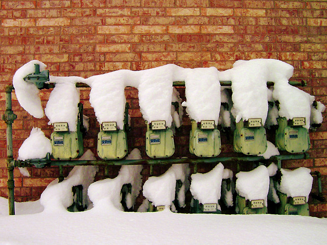
| I'm not so sure I consider symmetry a pattern. Since this could be argued either way, I'll abstain from voting on this particular image. Sorry. |
|
 Photographer found comment helpful. Photographer found comment helpful. |
|
|
01/02/2007 08:44:00 AM |
| Neat photo on the whole (nice "found" pattern). I would have liked to have seen a bit more attention to composition either in the shot or in the processing (a bit more cropping of the top, which seems to detract from the shot for my eye), and a bit more brightness to the color differences (especially as there are only three main colors in the image). |
|
| Photographer found comment helpful. |
|
|
01/02/2007 05:50:13 AM |
|
| Photographer found comment helpful. |
|
|
01/02/2007 12:57:01 AM |
| nice composition here. Simplistic looks good |
|
| Photographer found comment helpful. |
|
|
12/31/2006 12:57:31 PM |
| I think a tighter crop on just the top row of meters and the straightening of the horizon level would have really made this good picture a great picture. |
|
| Photographer found comment helpful. |
|
|
12/28/2006 02:34:01 PM |
|
| Photographer found comment helpful. |
|
|
12/27/2006 07:39:20 PM |
| I love this, but personally I would have cropped in tighter from the top...to make the machinery more dominant, and more of an abstract..? |
|
| Photographer found comment helpful. |
|
|
12/27/2006 10:56:33 AM |
|
| Photographer found comment helpful. |
|
|
12/27/2006 09:22:59 AM |
| Might have been better at an angle from the side to see some depth with the meter and the snow, lens distortion at the top of the bricks |
|
| Photographer found comment helpful. |
Home -
Challenges -
Community -
League -
Photos -
Cameras -
Lenses -
Learn -
Help -
Terms of Use -
Privacy -
Top ^
DPChallenge, and website content and design, Copyright © 2001-2025 Challenging Technologies, LLC.
All digital photo copyrights belong to the photographers and may not be used without permission.
Current Server Time: 04/07/2025 01:41:59 AM EDT.