| Author | Thread |
Comments Made During the Challenge  |
|
|
08/17/2002 11:57:00 PM |
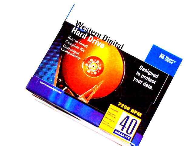
| I can see the newness. It's definately new. Did you chose that lighting on purpose? Looks over brightened and looks like the color has been altered dramatically. However, I don't know what the original box looks like, so I guess it's not fair of me to just assume that. Maybe a better background might make this a bit more exciting. You kind of lose the top of the box into the background. The clarity is good, I like how you can read all the words. Good luck with the challenge. |
|
|
|
08/16/2002 12:27:00 PM |
|
|
|
08/16/2002 05:28:00 AM |
| is this box scanned on a flatbed scanner? why is the image this harsh? |
|
|
|
08/15/2002 05:53:00 PM |
| I feel your pain. Just lost two Hard Drives on my server. Had to start from scratch. What good is redundency when failure is too? Nice shot. Perhaps could have been better beside the chassis of the machine as you make the switch, but I tend to like more dynamic photos from a subjective perspective. |
|
|
|
08/15/2002 04:36:00 PM |
| Good color. I may have been tempted to take the photo *directly* overhead so as to eliminate the bottom of the box. |
|
|
|
08/15/2002 12:42:00 PM |
| Ummm...Ok, the box is new but seriously...This photo is below average. I don't think you put enough effort into this submission. |
|
|
|
08/15/2002 12:49:00 AM |
| I get it, it's a new harddrive to fix your computer problems. Good luck, hope you didn't lose any photos. How about a new CD burner in that picture too? |
|
|
|
08/14/2002 03:27:00 PM |
| If you have a really low end camera, please ignore the rest of my comments and you have my sympathies...... Very grainy image with no appearant "reason" for it. A lack of details in the smaller writing on the packaging emphasizes this. The white of the box disappears into your background, I would politely suggest using a different background. 5 Swash |
|
|
|
08/14/2002 01:10:00 PM |
| New hard drive! Everyone's nightmare! Very clever. |
|
|
|
08/14/2002 12:01:00 PM |
| I have been down that road before! I liked the idea, but the top of the box seems to blend in the the white background. |
|
|
|
08/13/2002 06:42:00 PM |
Something new.
Composition - good
Technical Aspects - fair. Too bright, esp at top
Meets Challenge - yes
Visual Impact / Originality – fair
Jim msp
|
|
|
|
08/13/2002 03:58:00 PM |
| I dont like the washed out area at the top of the box tomlewis |
|
|
|
08/13/2002 01:52:00 PM |
| Too bright and not particularly original |
|
|
|
08/13/2002 11:51:00 AM |
| This is a nice attempt at a 'product' type photo... I do like the concept of the brightness and I can see where you were going with it. I would have preferred a little lower angle to give the box some added dimension, rather than being a flat, face on view.... The post processing here has taken a toll on the image as well. Whatever you have done to it has made a lot of visible jagged edges... possibly the sharpen filter... it has this effect when over used... :) - jmsetzler |
|
|
|
08/13/2002 09:06:00 AM |
| Seems to be a bit over processed. |
|
|
|
08/12/2002 09:57:00 PM |
Composition4
Technical Aspects4
Appeal5
Creativity5
Rating5Autool
|
|
|
|
08/12/2002 04:43:00 PM |
| i had to send one of those back once |
|
|
|
08/12/2002 12:45:00 AM |
| Just a little bright for me. |
|
Home -
Challenges -
Community -
League -
Photos -
Cameras -
Lenses -
Learn -
Help -
Terms of Use -
Privacy -
Top ^
DPChallenge, and website content and design, Copyright © 2001-2026 Challenging Technologies, LLC.
All digital photo copyrights belong to the photographers and may not be used without permission.
Current Server Time: 02/01/2026 10:05:09 AM EST.