| Author | Thread |
|
|
01/04/2007 10:51:09 AM |
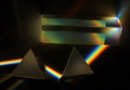
| Hey there -- been busy, wanted to enter, just now looking at the entries. Aweseome. You were soooo robbed, should have been top 20, IMHO. The reason for the score is evident by the comments -- the voters have obviously never seen the movie. Good work! Technically speaking, there's a bit of "tungsten" color cast in the whites & highlights that I might remove if it were my shot. |
|
Comments Made During the Challenge  |
|
|
12/26/2006 06:21:19 PM |
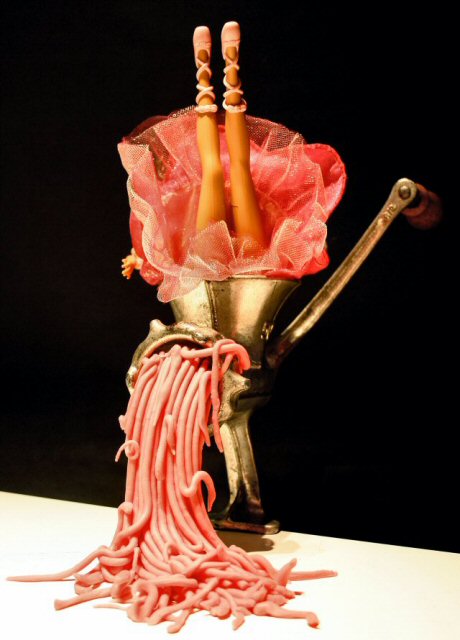
| Yeah, tasteful, hehehehehe :) Would have been even cooler if you had shoved your hand down there, that´s an idea I´ll let you have for "Pink Floyd II" :) |
|
|
|
12/26/2006 05:48:55 PM |
| Interesting; works as social commentary as well as PF. Looks a little over-saturated though. 7. |
|
|
|
12/25/2006 08:22:56 PM |
|
|
|
12/25/2006 04:08:14 PM |
|
|
|
12/24/2006 09:42:19 AM |
| I think this is perfect for the challenge, wow what an imagination! How did you ever come up with this? 9 |
|
|
|
12/23/2006 03:52:44 PM |
|
|
|
12/23/2006 02:06:07 PM |
| AHAHAHAHAHAHAHHAAHAH DIE BARBIE DIE!!!! bout damn time.. Ill give you a 7 just for getting rid of another barbie! |
|
|
|
12/23/2006 07:29:01 AM |
| I think this would fit much better with "Welcome to the Machine"! It's an interesting commentary on society consuming the people within it, chewing them up and spitting them out! Seems very soft to me but the concept and composition (with angled black and white background/ foreground) is great. |
|
|
|
12/23/2006 05:21:17 AM |
|
|
|
12/23/2006 01:01:42 AM |
| interesting idea, could be a little more in focus. |
|
|
|
12/22/2006 10:36:49 PM |
|
|
|
12/22/2006 10:07:34 PM |
| hmmm, maybe I need to listen to "Brick" again, but this is not the imagery I get from it. Another light source (reflector like a mirror would work) to create a defining "line" of light to separate your grinder from the background would help this a lot. The black just swallows the image. Tighter crop would strengthen your composition too. |
|
|
|
12/22/2006 07:59:55 PM |
| Wow, how creative!! It's good to see a shot with this title that doesn't have a wall in it. I like the composition and colors and everything really :-) |
|
|
|
12/22/2006 04:10:00 PM |
| I fancy being surreal. Octupus. |
|
|
|
12/22/2006 04:01:40 PM |
| Interesting idea. Lighting seems to be a bit harsh. The white bit at the bottom seems very over exposed. |
|
|
|
12/21/2006 12:49:08 PM |
|
|
|
12/20/2006 11:53:02 PM |
| nice concept and a brilliant take. |
|
|
|
12/20/2006 06:40:39 PM |
| LMFAO awesome although could use a little more clarity... 9 |
|
|
|
12/20/2006 08:08:36 AM |
|
|
|
12/20/2006 08:02:43 AM |
| LOL! I was wishing we had a meat grinder. Dang you. :) Very funny and good job matching up the color of the meat to the Barbie dress. |
|
|
|
12/20/2006 07:36:14 AM |
| awesome...wow, very creative |
|
|
|
12/20/2006 03:46:53 AM |
| very creative idea, but see no relation between title and subject |
|
|
|
12/20/2006 03:26:06 AM |
| I would have had no idea what the this was had I not been looking at Floyd pics today. LOL. Cool shot. I feel it's missing some insane person turning the crank though! |
|
|
|
12/20/2006 01:13:52 AM |
|
Home -
Challenges -
Community -
League -
Photos -
Cameras -
Lenses -
Learn -
Help -
Terms of Use -
Privacy -
Top ^
DPChallenge, and website content and design, Copyright © 2001-2026 Challenging Technologies, LLC.
All digital photo copyrights belong to the photographers and may not be used without permission.
Current Server Time: 02/01/2026 05:54:53 AM EST.