| Author | Thread |
Comments Made During the Challenge  |
|
|
10/30/2003 07:33:12 AM |
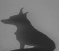
| I have to be honest here and say that this looks more like a text effect than a photograph. I like the blur on the tops of the letters, but feel the bottom is cropped too tight. I would much rather see the original item and its shadow than just this snippet of the shadow. |
|
 Photographer found comment helpful. Photographer found comment helpful. |
|
|
10/29/2003 12:40:31 PM |
| Nice idea. Very creative. 7. |
|
| Photographer found comment helpful. |
|
|
10/28/2003 03:10:45 PM |
|
| Photographer found comment helpful. |
|
|
10/26/2003 09:19:20 PM |
| *smile* I had exactly the same idea as this but didn;t manage to pull it off. This has worked nicely, well done :) |
|
| Photographer found comment helpful. |
Home -
Challenges -
Community -
League -
Photos -
Cameras -
Lenses -
Learn -
Help -
Terms of Use -
Privacy -
Top ^
DPChallenge, and website content and design, Copyright © 2001-2025 Challenging Technologies, LLC.
All digital photo copyrights belong to the photographers and may not be used without permission.
Current Server Time: 04/07/2025 12:50:19 PM EDT.