| Author | Thread |
|
|
12/22/2006 11:14:50 AM |
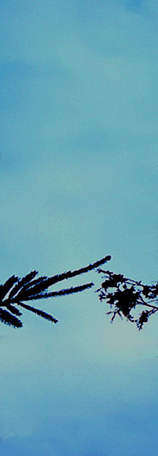
I think you suffered for having a simple image in a challenge with so many visually powerful images. That said, I'll admit to voting this a 4. It just didn't grab me, the branches seem blurry, and the tight vertical shape didn't capture the grand feeling I have for the sky.
On the other hand, Don made it a favorite.
Simplicity can work for the broader voting audience, though. Look at BradP's entry, as well as his challenge entry "Solo."
Just accept you didn't hit the mark with most voters, decide whether you like it anyway, and keep shooting. :) |
|
 Photographer found comment helpful. Photographer found comment helpful. |
|
|
12/22/2006 10:43:03 AM |
| I only gave this a 6 because I'm a shortsighted narrow-minded DPC voter, but the concept here is wonderful and so very poetic. |
|
| Photographer found comment helpful. |
|
|
12/22/2006 07:17:09 AM |
Brown Ribbon! Way to go Hotshot - I always wanted one of those. (I always wanted blue ribbons and universal accolade, but sometimes we have to be a little practical). The picture idea is fascinating of itself. I dare say if you edited the hell out of it, say with a couple of sharper silhouettes/details of the branches, both angled slightly upwards with lots of sky space above them . . .
Still n all - move on :) |
|
| Photographer found comment helpful. |
Comments Made During the Challenge  |
|
|
12/21/2006 06:41:00 PM |
| The composition appeals to me. |
|
| Photographer found comment helpful. |
|
|
12/19/2006 03:17:22 PM |
| good idea, but the picture seems too simple... |
|
| Photographer found comment helpful. |
|
|
12/18/2006 07:07:54 PM |
|
| Photographer found comment helpful. |
|
|
12/16/2006 09:38:40 PM |
| too small and very grainy |
|
| Photographer found comment helpful. |
|
|
12/16/2006 07:34:00 PM |
| Was there a purpose in making this so thin? It's not a good look expecially with nothing much in the frame. |
|
| Photographer found comment helpful. |
|
|
12/16/2006 04:44:30 PM |
|
| Photographer found comment helpful. |
|
|
12/15/2006 10:23:16 PM |
| Nice pun, but they're gonna get you for that crop... |
|
| Photographer found comment helpful. |
|
|
12/15/2006 07:38:32 PM |
| I just don't find this photo that interesting. It also seems to suffer from a lot of noise. |
|
| Photographer found comment helpful. |
|
|
12/15/2006 07:03:19 PM |
|
| Photographer found comment helpful. |
|
|
12/15/2006 04:02:53 PM |
|
| Photographer found comment helpful. |
|
|
12/15/2006 03:28:01 PM |
| I like the crop here. Good idea. The image it's self is a bit boring. Not much of a sky. :( |
|
| Photographer found comment helpful. |
|
|
12/15/2006 10:57:43 AM |
|
| Photographer found comment helpful. |
|
|
12/15/2006 09:51:57 AM |
| I think this Challenge is looking for something else. |
|
| Photographer found comment helpful. |
|
|
12/15/2006 08:28:26 AM |
| funny, not clear enough though. |
|
| Photographer found comment helpful. |
|
|
12/15/2006 03:30:22 AM |
| It is sky, and it does hold a certain interest. I think that is needs a bit more to really hold the viewer. |
|
| Photographer found comment helpful. |
|
|
12/15/2006 02:43:01 AM |
| Good title and composition, but noisy and unsharp picture. |
|
| Photographer found comment helpful. |
|
|
12/15/2006 01:02:23 AM |
| I like the way you have cropped the photo but I feel the photo lacks on technicals. Seems like its very tightly cropped and jpeg artifacts are visible.5. |
|
| Photographer found comment helpful. |
|
|
12/15/2006 12:11:32 AM |
| Too flat, not enough contrast and detail for me. |
|
| Photographer found comment helpful. |
Home -
Challenges -
Community -
League -
Photos -
Cameras -
Lenses -
Learn -
Help -
Terms of Use -
Privacy -
Top ^
DPChallenge, and website content and design, Copyright © 2001-2026 Challenging Technologies, LLC.
All digital photo copyrights belong to the photographers and may not be used without permission.
Current Server Time: 02/01/2026 03:51:43 AM EST.