| Author | Thread |
Comments Made During the Challenge  |
|
|
12/19/2006 01:26:19 PM |
|
|
|
12/16/2006 05:17:01 PM |
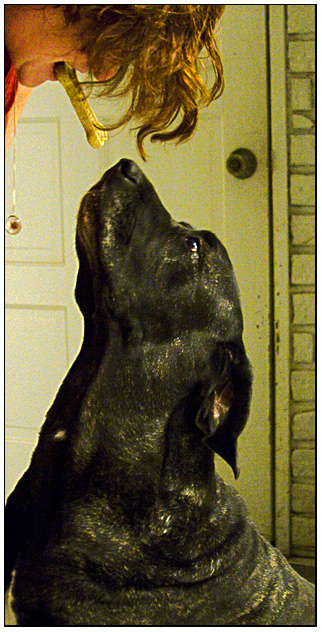
| 4 - Pretty grungy feel to this which is likely deliberate. Bit too vertical overall in my opinion and the dog is not 'starring' enough. |
|
 Photographer found comment helpful. Photographer found comment helpful. |
|
|
12/16/2006 03:59:54 AM |
| To me, a portrait has controlled lighting and setting. This shot looks too green, there is no detail in the face of the dog, and I don't think the door makes a good background. This shot tells a story, but it is not a portrait IMO. |
|
| Photographer found comment helpful. |
|
|
12/14/2006 02:55:22 PM |
Virgil isn't spoiled at all, is he?
Cute picture, but the grainy quality and yellowish lighting don't really work for me. Was your ISO set quite high? |
|
| Photographer found comment helpful. |
|
|
12/14/2006 11:48:52 AM |
| Great pose and composition. (Better if door jamb were perfectly vertical, and yellow greeny cast in background lightened or warmed. Picture deserves it). |
|
| Photographer found comment helpful. |
|
|
12/14/2006 07:14:08 AM |
| Seems a little grainy. A cleaner background also helps to make it more of a portrait then a snap shot. |
|
| Photographer found comment helpful. |
|
|
12/14/2006 06:28:37 AM |
| Nice choice of cropping, but the saturation is a little too overdone for me. |
|
| Photographer found comment helpful. |
|
|
12/13/2006 04:16:42 PM |
| grainy on my monitor ... the BG isn't very appealing either ... |
|
| Photographer found comment helpful. |
|
|
12/13/2006 03:23:32 PM |
| Might look better if it was just the bone showing |
|
| Photographer found comment helpful. |
|
|
12/13/2006 10:42:15 AM |
| The noise is a little distracting |
|
|
|
12/13/2006 10:07:11 AM |
| image seems a little noisy |
|
| Photographer found comment helpful. |
|
|
12/13/2006 07:43:49 AM |
| the colors seem off on this photo - possibly due to white balance issues |
|
| Photographer found comment helpful. |
Home -
Challenges -
Community -
League -
Photos -
Cameras -
Lenses -
Learn -
Help -
Terms of Use -
Privacy -
Top ^
DPChallenge, and website content and design, Copyright © 2001-2025 Challenging Technologies, LLC.
All digital photo copyrights belong to the photographers and may not be used without permission.
Current Server Time: 04/07/2025 01:50:22 AM EDT.