| Author | Thread |
Comments Made During the Challenge  |
|
|
12/01/2006 08:10:16 PM |
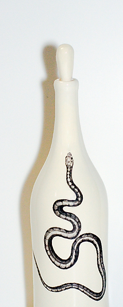
| Interesting shot - definitely white |
|
 Photographer found comment helpful. Photographer found comment helpful. |
|
|
12/01/2006 12:22:15 PM |
| I find the shadow of the bottle a bit distracting but the white background is well done and the overall effect is good. |
|
| Photographer found comment helpful. |
|
|
11/29/2006 10:47:57 AM |
| i think it would look better if the shadow wasn't so dark....i fill card would have done the trick |
|
| Photographer found comment helpful. |
|
|
11/28/2006 07:19:18 AM |
| The shadow is kind of harsh. Why didn't you show us the whole bottle? |
|
| Photographer found comment helpful. |
|
|
11/27/2006 02:39:38 PM |
| I really like the concept. Maybe onsider a layer mask or background toning to decrease the bluish cast. |
|
| Photographer found comment helpful. |
|
|
11/27/2006 08:11:06 AM |
| I don't like the shadow on the left side of the image - the outline of the bottle (seen on the right) is much more appealing. |
|
| Photographer found comment helpful. |
|
|
11/27/2006 06:49:02 AM |
| I don't think the shadow enhances the form of the bottle. Would like to see the entire bottle...the way it is the artwork on the bottle has become the subject which is not very interesting in this presentation. |
|
| Photographer found comment helpful. |
Home -
Challenges -
Community -
League -
Photos -
Cameras -
Lenses -
Learn -
Help -
Terms of Use -
Privacy -
Top ^
DPChallenge, and website content and design, Copyright © 2001-2025 Challenging Technologies, LLC.
All digital photo copyrights belong to the photographers and may not be used without permission.
Current Server Time: 04/06/2025 11:00:11 PM EDT.