| Author | Thread |
Comments Made During the Challenge  |
|
|
12/03/2006 05:34:02 PM |
| Beautifully presented. So crisp and clean. Nice job! |
|
|
|
12/02/2006 06:20:14 AM |
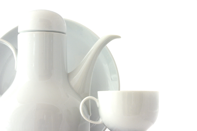
| Nice composition, although I think that this would look a lot better in a square crop. The reflection of the room in the china is one big minus, and another minus is the complete removal of the background. 5 |
|
|
|
11/30/2006 06:50:53 PM |
| Good study in shapes, good light colour on white. It looks a little soft throughout on my screen. ~7 |
|
|
|
11/30/2006 02:22:22 PM |
I think I can see you... ;-)
TC |
|
|
|
11/30/2006 03:45:18 AM |
| This composition has nice balance to it, although I would have moved the cup left enough to cover the small gap at the bottom (edge of plate). You did a good job with getting a good white background (not grey, yellow, etc... as many others struggled with). Lighting is ok with the main source on the left. Some bounce light from the other direction would help a little. The reflections are somewhat distracting but can be tough to eliminate entirely (different camera angle, more white material in immediate surrounding, etc...). Being that this is an advanced challenge with more liberal editing rules I would have applied a slight gaussian blur to the reflections, at least enough to not make it possible to see the camera, photographer, and doorway in the bottom left reflection. :D All of the above is JMO of course. Best of luck to you in the challenge. |
|
|
|
11/28/2006 08:05:33 PM |
|
|
|
11/28/2006 02:04:03 PM |
|
|
|
11/28/2006 05:19:33 AM |
|
|
|
11/27/2006 01:27:27 PM |
| classy, however it's blown a little on the upper left. You could've burned it a little on that edge |
|
|
|
11/27/2006 12:31:21 PM |
| Almost prefect, cupple of blown out spots. |
|
|
|
11/27/2006 07:34:46 AM |
| A fair still-life study. I think the camera angle is a tad low (or is it too wide of an angle on the lens) making it feel not quite level and not quite vertical. I like repetition in form but cutting off the handle of the carafe takes away one of those repetitions. The handle of the cup frames an inconsequential part of the whole and might have been more rhythmic if it had been turned to the outside. This set up is difficult to light and keep good reflections in the surfaces--that I think you handled well. |
|
|
|
11/26/2006 10:19:02 PM |
| Nice refelctions but it's a bit dull (the subject I mean) |
|
|
|
11/26/2006 10:01:31 PM |
|
Home -
Challenges -
Community -
League -
Photos -
Cameras -
Lenses -
Learn -
Help -
Terms of Use -
Privacy -
Top ^
DPChallenge, and website content and design, Copyright © 2001-2025 Challenging Technologies, LLC.
All digital photo copyrights belong to the photographers and may not be used without permission.
Current Server Time: 04/08/2025 05:08:40 AM EDT.