| Author | Thread |
|
|
02/12/2007 12:59:08 AM |
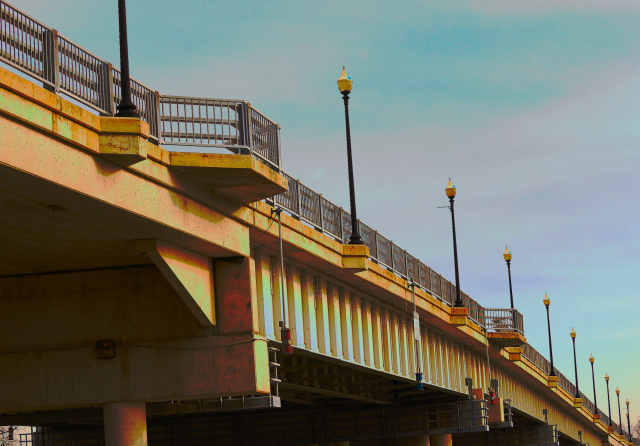
Heh. I'm poking around your "Where I Live" collection, and not realizing these are challenge entries. My firs thought on opening this one was "oh, nice strong diagonal!" :)
I think this is a case where color hurts the strong lines and interesting shapes. Not only would I try a B&W conversion, I'd suggest going back at night with a tripod. I bet those lamps would be beautiful. |
|
 Photographer found comment helpful. Photographer found comment helpful. |
|
|
12/06/2006 07:38:35 PM |
| I expected this would score a bit higher. I think the lines are nice, the focus is crisp, and the colors are lovely. |
|
| Photographer found comment helpful. |
|
|
12/06/2006 09:29:51 AM |
| I like it. The saturation seems a little heavy on the bridge, but this is basic editing, so hard to get the sky right without overdoing the rest. Do you use selective colors when saturating? I would tone down the red and yellow just a little. But then people would probably say it's washed out. You can't please everyone. |
|
| Photographer found comment helpful. |
Comments Made During the Challenge  |
|
|
12/03/2006 02:36:03 PM |
| Nice natural diagonal, the colours in the sky are pretty. Is this HDR or tone-mapped? ~6 |
|
| Photographer found comment helpful. |
|
|
12/01/2006 06:13:11 AM |
| The color is screwed and the contrast is lacking. |
|
| Photographer found comment helpful. |
Home -
Challenges -
Community -
League -
Photos -
Cameras -
Lenses -
Learn -
Help -
Terms of Use -
Privacy -
Top ^
DPChallenge, and website content and design, Copyright © 2001-2026 Challenging Technologies, LLC.
All digital photo copyrights belong to the photographers and may not be used without permission.
Current Server Time: 02/01/2026 08:24:57 AM EST.