| Author | Thread |
Comments Made During the Challenge  |
|
|
11/28/2006 06:36:41 PM |
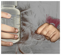
| Could add some nail polish or show less of the finger with a more pleasable view of the nail.. |
|
|
|
11/28/2006 04:31:12 PM |
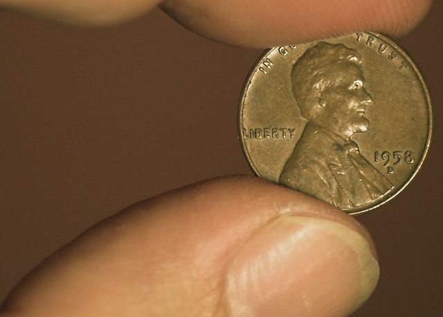
| Well, that is a very simple composition and I really like it. Gets the point across rather well. |
|
|
|
11/28/2006 10:54:50 AM |
|
|
|
11/27/2006 08:31:27 PM |
| come on surely there is more than a coin to remember your birth year by, although it would make a good necklace. |
|
|
|
11/25/2006 08:17:50 AM |
| Hmmm.. it meets the challenge, but I find it lacks a "story" or that it says anything about you, or the era... As is, would have made a tighter crop and enriched the hues. |
|
 Photographer found comment helpful. Photographer found comment helpful. |
|
|
11/24/2006 08:12:27 AM |
| hey look another coin :) great placement tho |
|
| Photographer found comment helpful. |
|
|
11/24/2006 06:22:42 AM |
|
| Photographer found comment helpful. |
|
|
11/22/2006 02:48:04 PM |
| good sharp macro. color seems a little off but it might be my monitor. |
|
| Photographer found comment helpful. |
|
|
11/22/2006 10:44:28 AM |
| No year in the title, but I think I figured it out anyway. :) The colors are a little bland for my taste. |
|
| Photographer found comment helpful. |
|
|
11/22/2006 10:09:22 AM |
| The image is a little drab and the eyes are continually drawn to the thumb both due to its relative size in frame and it's brightness which pushes the penny to secondary importance. |
|
| Photographer found comment helpful. |
|
|
11/22/2006 07:03:11 AM |
| You forgot to put the year in your title (even though it is in the pic). Nice closeup! |
|
| Photographer found comment helpful. |
|
|
11/22/2006 06:28:00 AM |
| Nice photo of a penny. The overall image doesn't say much to the view, except "here's what a 58 penny looks like". The fingers don't add to the shot, and the nail chip detracts. 4 |
|
|
|
11/22/2006 04:39:56 AM |
| Good composition, but I think I would have liked it better with a little more finger on top to frame it out. Also about the background color...I think it compliments the coin very nicely. |
|
| Photographer found comment helpful. |
Home -
Challenges -
Community -
League -
Photos -
Cameras -
Lenses -
Learn -
Help -
Terms of Use -
Privacy -
Top ^
DPChallenge, and website content and design, Copyright © 2001-2025 Challenging Technologies, LLC.
All digital photo copyrights belong to the photographers and may not be used without permission.
Current Server Time: 04/08/2025 01:46:52 AM EDT.