| Author | Thread |
|
|
11/07/2014 07:18:19 AM |
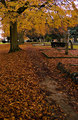
| i wish the top of the sign had more breathing room |
|
 Photographer found comment helpful. Photographer found comment helpful. |
|
|
11/29/2006 10:42:15 AM |
| Thanks for the comments! It really gave me insight on what DPC'ers like and dislike. |
|
Comments Made During the Challenge  |
|
|
11/27/2006 03:29:49 PM |
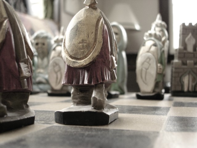
| too much out of focus, and the statue in the front is cut off. |
|
| Photographer found comment helpful. |
|
|
11/25/2006 12:03:40 PM |
| The head being cut off on the subject chess piece is distracting. |
|
| Photographer found comment helpful. |
|
|
11/24/2006 07:05:04 AM |
| Interesting perspective shot. The chess set looks huge, and the board looks like the floor. BTW the chess set is fabulous. I wonder if you could have gotten all the chess pieces in focus and still carried off the illusion. |
|
| Photographer found comment helpful. |
|
|
11/24/2006 02:44:28 AM |
| cropped head off chess piece is distracting |
|
| Photographer found comment helpful. |
|
|
11/23/2006 06:30:05 PM |
| this looks really cool *thumbs up* |
|
| Photographer found comment helpful. |
|
|
11/22/2006 02:51:48 PM |
| i wish there was more color |
|
| Photographer found comment helpful. |
|
|
11/22/2006 04:52:07 AM |
| too bright and out of focus |
|
| Photographer found comment helpful. |
Home -
Challenges -
Community -
League -
Photos -
Cameras -
Lenses -
Learn -
Help -
Terms of Use -
Privacy -
Top ^
DPChallenge, and website content and design, Copyright © 2001-2025 Challenging Technologies, LLC.
All digital photo copyrights belong to the photographers and may not be used without permission.
Current Server Time: 04/07/2025 01:12:47 PM EDT.