| Author | Thread |
Comments Made During the Challenge  |
|
|
11/26/2006 01:08:47 PM |
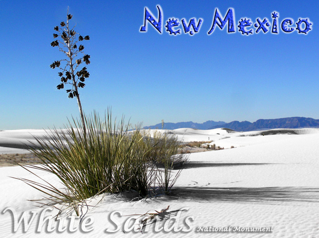
| Great photo, but the bottom text covers up too much of that lovely texture |
|
 Photographer found comment helpful. Photographer found comment helpful. |
|
|
11/26/2006 11:14:30 AM |
| Very pretty shot, love the soft colours bumping to 9. |
|
| Photographer found comment helpful. |
|
|
11/26/2006 07:16:14 AM |
| wow that looks just like snow.. |
|
| Photographer found comment helpful. |
|
|
11/26/2006 12:38:43 AM |
| Love the fonts used on this one. Nice shot! 8 |
|
| Photographer found comment helpful. |
|
|
11/25/2006 08:59:04 PM |
| Yep...Less is more. A beautiful image. My only suggestion is that the text at the bottom is distracting and I think it would have done its job just as well by being in small typeface just under the main heading...Anyway I'm sure you don't really want a desktop publishing critique :) As I said a beautiful and surprisingly evocative image. |
|
| Photographer found comment helpful. |
|
|
11/25/2006 06:18:13 AM |
|
| Photographer found comment helpful. |
|
|
11/24/2006 04:43:51 PM |
| One of my four 10's in this challenge. I love the natural looking colors, the fact that you didn't oversaturate this. Not 100% pleased with the conflicting fonts (but I do like each one), but the photo is lovely. |
|
| Photographer found comment helpful. |
|
|
11/24/2006 03:39:49 PM |
| Nice postcard. The picture is very good, nice colors, details and compostition. The New Mexico text looks good on it because it gives a kind of Mexican feeling to the picture which does not IMHO look very Mexican. Well done and good luck :o) |
|
| Photographer found comment helpful. |
|
|
11/24/2006 11:26:10 AM |
| Nice shot, great fonts and placement of the text. |
|
| Photographer found comment helpful. |
|
|
11/23/2006 03:54:24 PM |
|
| Photographer found comment helpful. |
|
|
11/22/2006 11:40:32 AM |
| perfect postcard shot.. 8 |
|
| Photographer found comment helpful. |
|
|
11/22/2006 08:01:32 AM |
| Lovely photo, and the choice of and color of lettering at the bottom was excellent. I also think the lettering at the top is fun, but I'm not sure I like the mixture with the other typeface at the bottom. Even so, I like the post card. 7 |
|
| Photographer found comment helpful. |
|
|
11/22/2006 02:14:13 AM |
| I love the closeness of the plant coupled with the vastness of the landscape. Excellent! |
|
| Photographer found comment helpful. |
|
|
11/22/2006 02:01:18 AM |
| Its very beautiful... but feels that too much text or maybe could be bit smaler. |
|
| Photographer found comment helpful. |
|
|
11/22/2006 01:41:22 AM |
| great, i love this one, simple and clear ! |
|
| Photographer found comment helpful. |
|
|
11/20/2006 05:52:51 PM |
| I actually thought about driving down to White Sands to take a photo for this competition. I am glad I didn't because I don't think I could have topped this one. Nice Shot! |
|
| Photographer found comment helpful. |
|
|
11/20/2006 12:29:58 PM |
| Very nice job! Nice comp and contrast. |
|
| Photographer found comment helpful. |
|
|
11/20/2006 04:01:40 AM |
| hehe it works great as a postcard. |
|
| Photographer found comment helpful. |
Home -
Challenges -
Community -
League -
Photos -
Cameras -
Lenses -
Learn -
Help -
Terms of Use -
Privacy -
Top ^
DPChallenge, and website content and design, Copyright © 2001-2025 Challenging Technologies, LLC.
All digital photo copyrights belong to the photographers and may not be used without permission.
Current Server Time: 04/07/2025 02:15:16 AM EDT.