| Author | Thread |
|
|
11/29/2006 01:49:03 AM |
| nice shot. the title it very good too. |
|
 Photographer found comment helpful. Photographer found comment helpful. |
Comments Made During the Challenge  |
|
|
11/25/2006 08:12:13 PM |
| Would be a much better larger print it seems. |
|
|
|
11/24/2006 10:07:48 AM |
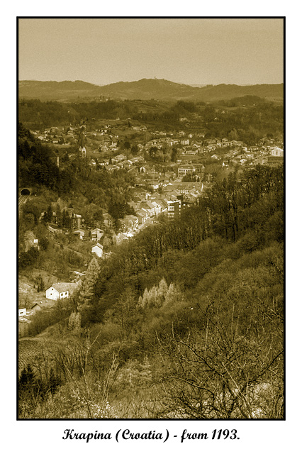
| I like the choice of sepia style to this - emphasizes the point of your card. |
|
| Photographer found comment helpful. |
|
|
11/23/2006 09:49:23 PM |
| Great photo in Sepiatone! Oh, by the way, if you're a Good Sport with a good sense of humor, please consider sending a copy of this photo (title and all) to www.craptography.com ...The name alone is worth the price of admission! :} |
|
|
|
11/23/2006 12:51:49 PM |
| Nice capture, but the colouring isn't appealing or eye catching. |
|
| Photographer found comment helpful. |
|
|
11/22/2006 01:56:11 AM |
| Its cute and i like the oldness effect. |
|
| Photographer found comment helpful. |
|
|
11/22/2006 01:17:37 AM |
|
|
|
11/22/2006 12:58:06 AM |
| I like the old look on this one |
|
| Photographer found comment helpful. |
|
|
11/21/2006 12:45:10 PM |
| Very nice tone and presentation. One of my personal favourites of the competition. 8. |
|
| Photographer found comment helpful. |
|
|
11/20/2006 05:44:17 AM |
|
|
|
11/19/2006 07:21:20 PM |
| the lack of detail and color tones makes the image very average |
|
| Photographer found comment helpful. |
Home -
Challenges -
Community -
League -
Photos -
Cameras -
Lenses -
Learn -
Help -
Terms of Use -
Privacy -
Top ^
DPChallenge, and website content and design, Copyright © 2001-2025 Challenging Technologies, LLC.
All digital photo copyrights belong to the photographers and may not be used without permission.
Current Server Time: 04/08/2025 01:43:44 AM EDT.