| Author | Thread |
Comments Made During the Challenge  |
|
|
11/26/2006 06:35:55 PM |
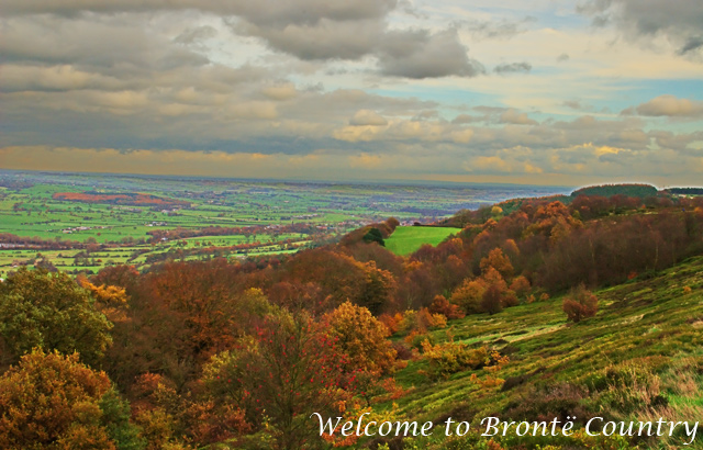
| A few problems here, although the view is nice. The greens seem way too saturated. The horizon is tilted, but not enough to show you meant to do that. And the horizon's pretty close to the middle, which makes it less interesting. Finally, my eye yearns for more contrast. I bet you could get those clouds looking pretty dramatic. |
|
 Photographer found comment helpful. Photographer found comment helpful. |
|
|
11/26/2006 01:37:07 PM |
| this looks a bit like hdr gone wrong: too much colour, some haloing, giving an unrealistic image. Horizon looks a bit wonky. |
|
| Photographer found comment helpful. |
|
|
11/26/2006 01:07:25 PM |
| Colours don't work. Good picture compositionally. |
|
| Photographer found comment helpful. |
|
|
11/25/2006 01:58:53 PM |
| Lovely presentation with that oil color like look that enhances certain colors to bring out the charm! Bump. |
|
| Photographer found comment helpful. |
|
|
11/25/2006 12:17:09 PM |
| I think the horizontal is slightly tilted to the right, but I like the colors and the DOF |
|
| Photographer found comment helpful. |
|
|
11/24/2006 06:35:36 PM |
| The bizarre colors make for an interesting effect, but it's too unnatural for my taste. Also the glow around the tree-tops on the far right is too obvious. And the horizon looks tilted. |
|
| Photographer found comment helpful. |
|
|
11/24/2006 11:03:15 AM |
| the colors are perfectly lovely |
|
| Photographer found comment helpful. |
|
|
11/22/2006 11:28:08 AM |
| far too oversaturated.. have you attempted HDR here? not really working for me I am afraid.. |
|
| Photographer found comment helpful. |
|
|
11/22/2006 08:30:10 AM |
| In postcardland, the horizons should be straight... I like the coloring though. |
|
| Photographer found comment helpful. |
|
|
11/21/2006 05:04:10 PM |
| the greens are just slightly over saturated - not much but a little and the horizon seems a little off of level - maybe it is due to a hill on the left side? |
|
| Photographer found comment helpful. |
|
|
11/21/2006 04:54:09 PM |
| Whoa... the colors look really out of whack on this one, I'm afraid. Looks like maybe you had adjusted the shadows and then pumped up the saturation a bit too far. |
|
| Photographer found comment helpful. |
|
|
11/21/2006 10:51:36 AM |
| the colours here look very unnatural |
|
| Photographer found comment helpful. |
|
|
11/21/2006 05:02:12 AM |
| experimenting with HDR? oversaturated and somehow flat at the same time, for me... |
|
| Photographer found comment helpful. |
|
|
11/20/2006 12:17:33 PM |
| too much PP on the background |
|
| Photographer found comment helpful. |
|
|
11/20/2006 07:53:53 AM |
| Too highly saturated for my taste. |
|
| Photographer found comment helpful. |
|
|
11/20/2006 05:58:06 AM |
| horizon is tilted and colors seem a bit unnatural ... sorry |
|
| Photographer found comment helpful. |
|
|
11/20/2006 12:28:29 AM |
| horizon is tilted, colors are unnatural |
|
| Photographer found comment helpful. |
|
|
11/19/2006 07:14:12 PM |
| first thing in noticed was slanted horizon, little over sat for me. |
|
| Photographer found comment helpful. |
Home -
Challenges -
Community -
League -
Photos -
Cameras -
Lenses -
Learn -
Help -
Terms of Use -
Privacy -
Top ^
DPChallenge, and website content and design, Copyright © 2001-2025 Challenging Technologies, LLC.
All digital photo copyrights belong to the photographers and may not be used without permission.
Current Server Time: 04/12/2025 07:25:50 PM EDT.