| Author | Thread |
Comments Made During the Challenge  |
|
|
11/26/2006 02:50:03 PM |
| Kinda busy, but that's how Vegas is !! |
|
 Photographer found comment helpful. Photographer found comment helpful. |
|
|
11/24/2006 05:53:09 PM |
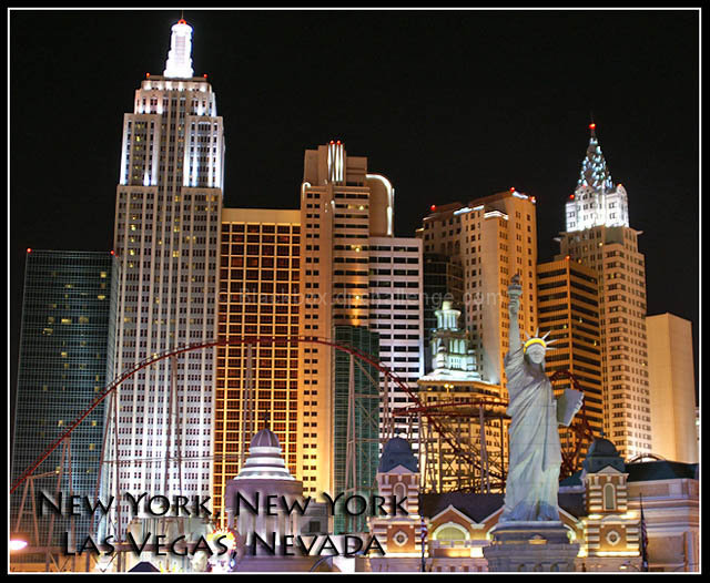
| This looks just like a Vegas postcard, great picture... |
|
| Photographer found comment helpful. |
|
|
11/24/2006 12:28:49 PM |
| I do not like the tilt but I like the composition |
|
| Photographer found comment helpful. |
|
|
11/24/2006 10:18:02 AM |
| Good visual impact and very nice job with the lettering. |
|
| Photographer found comment helpful. |
|
|
11/22/2006 10:48:21 PM |
| Very nice and "postcardy" looking. I wonder how the text would have looked in the upper right corner so it wouldn't have covered the buildings. |
|
| Photographer found comment helpful. |
|
|
11/22/2006 02:25:08 PM |
| Well, this is disorienting. Great shot. |
|
| Photographer found comment helpful. |
|
|
11/22/2006 03:40:08 AM |
| All of your buildings are leaning to the right. Otherwise composition is well done and text fits in a perfect spot. |
|
| Photographer found comment helpful. |
|
|
11/21/2006 11:39:12 AM |
| Nice image, and the text works well with it. The font does blend into the photo a little too much, but I see an attempt has been made to fix that with the outer glow. Good choice. 9 |
|
| Photographer found comment helpful. |
|
|
11/20/2006 12:55:23 PM |
I'm voting this a 6. Why not a 10? The buildings all lean to the right. If you use Photoshop, try exploring the image->transform-> tools. Skewing the upper left corner to the left would've straightened out the buildings.
Also, the text is hard to read because of the font, shadow, and placement. Given that it's Vegas, something neonish in the upper right would've made it easy to read. |
|
| Photographer found comment helpful. |
|
|
11/20/2006 12:12:08 PM |
| like the image. Might have taken care of the distortion cause by the wide-angle lens though. |
|
| Photographer found comment helpful. |
|
|
11/20/2006 05:40:11 AM |
| The text could be better presented for readability here, as it currently gets lost in all the detail of the photo. |
|
| Photographer found comment helpful. |
|
|
11/20/2006 04:25:20 AM |
|
| Photographer found comment helpful. |
|
|
11/19/2006 11:25:31 PM |
Be careful with your perspective, the buildings have that 'leaning back' look. This can be fixed in post with most editing programs.
I think I would have put the text in the upper right corner to keep it from competing with the details.
Good colors and exposure otherwise. |
|
| Photographer found comment helpful. |
Home -
Challenges -
Community -
League -
Photos -
Cameras -
Lenses -
Learn -
Help -
Terms of Use -
Privacy -
Top ^
DPChallenge, and website content and design, Copyright © 2001-2025 Challenging Technologies, LLC.
All digital photo copyrights belong to the photographers and may not be used without permission.
Current Server Time: 04/07/2025 12:56:44 AM EDT.