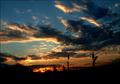
Taken whilst on a shoot, a very last second entry with no ideas at all, just saw it, thought it looked nice so shot it.
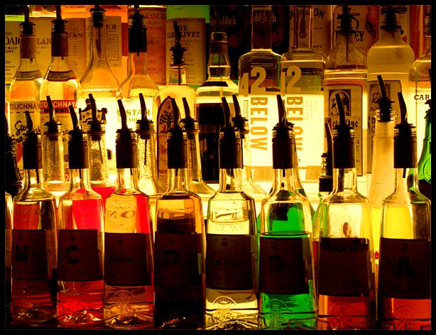
After too may '0ut Of Focus' comments on images taken in f2-4, and others 'not getting' my point, I am going full hog for the basic shot and interested to see how it does. To me this is quite dull, composition is neither flat-on or tilted, no lines so my eyes are everywhere.
So all it's got going for it is pretty colors and meets the challenge in an obvious way.
Kind of hope this doesn't do too well and beat my pb ;)
Statistics
Place: 26 out of 132 Avg (all users): 6.1818 Avg (commenters): 7.7500 Avg (participants): 6.0345 Avg (non-participants): 6.3731 Views since voting: 1249 Votes: 154 Comments: 14 Favorites: 0
Hi from the critique club Jon - doing my bit for rationality etc.
Gave this a 6, which is absolutely my average mark these days, and I don't know that I'd change that. Your own comments I think are spot-on, though I'm not completely convinced about the challenge: many many people took shots that I think would more appropriately have been for a challenge called 'Light' rather than 'Lighting', and i was hoping for more people to use light to shape and define their subjects, rather than go for pretty patterns: there are those here who have the ability, and few did. So within those terms, I didn't think this was out of the ordinary, but within the terms imposed by what was actually entered, it was a little above ordinary - so placing 26th is pretty good.
The colours seem a touch cast - like they've been pushed toward the incandescent spectrum, rather than a 'true' centred spectrum: if the light coming directly through the bottles above the liquids was more 'white' i think the colours would jump more, though perhaps the feeling of a dark bar and a glow from behind the bottles would be lost. It does transmit something of that feeling, of those nights when the barman just seems to be a silhouette, and you can't quite amke out the labels on the bottles, but perhps needs a figure to really do that; as it is, as you say, it's just patterns, and no particular focus.
:-) Nice idea and a good effect. Perhaps just a tad brighter would be better? Then again, this way it portrays the atmosphere in a bar well. One other thing: there's no focal point for the eye to fix on.
Great subject! The lighting brings out the colors well and keeps it looking like it is set in a bar, instead of a stale light from a supermarket. Very warm tones to it. I like the clarity of the picture, good focus. Fun image! 7
I gotta say this has taken first position in my favourites for this challenge. The combination of glass, color and light will always go down well at DPC, and you can be sure you'll be way up the top with this pic.
Maybe it's the mix of colors and light, but I really like this. The tone is good, it sets the mood perfectly, my own personal experience also enhances this as it's a sight I'm use to seeing and thus in my mind I see this as a slice of the bigger bar. I could see this as both a print hanging on a wall and used in advertising. A very pretty shot.
Nice work.
It is to bad the front row of bottles couldn't have had the same amount of light as the top row. Would have given it so much more punch? Still a nice vote.