| Author | Thread |
|
|
11/27/2006 08:53:49 AM |
| Great shot ralphy mate well done |
|
|
|
11/26/2006 11:28:29 PM |
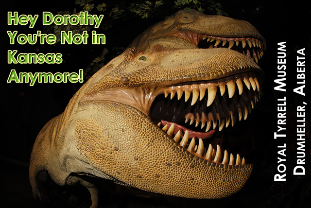
| Okay, I'm not going crazy, there's a reason I didn't remember seeing these guys at Tyrell! :) |
|
Comments Made During the Challenge  |
|
|
11/26/2006 05:46:23 PM |
| Picture nicely taken, but too much wordings in the postcard. Very distracting. |
|
|
|
11/25/2006 10:40:31 PM |
|
|
|
11/25/2006 02:02:48 AM |
| I would make the suggestion to make the green text on the left be the title and remove it from the image. I think the text on the right is good. As for the image, it's GREAT, but overpowered unfortunately by all the text. Nice wide-angle shot. |
|
|
|
11/24/2006 10:01:13 AM |
| The photograph is excellent - I like the "not in Kansas" part, too. Not as sure about the opposite lettering (vertical) but it is different! |
|
|
|
11/22/2006 10:43:48 AM |
| Very dramatic. I don't think it needs the 'Hey Dorothy..' comment, although it's funny. It is such a beautiful shot that the museum name and location are all you need. |
|
|
|
11/21/2006 03:59:55 PM |
| A neat photo. There is good color and decent lighting - but the text on the left of the screen does not fit with the text on the right |
|
|
|
11/21/2006 11:27:29 AM |
| Too much writing and it doesn't really seem to match the style of the photograph. Cool photo, though, especially against the 'blackground'. |
|
|
|
11/20/2006 11:25:13 PM |
| Very funny postcard, the font lacks something though. |
|
|
|
11/20/2006 12:15:44 AM |
| I dont see how the dorothy thing has anything to do with Alberta |
|
|
|
11/19/2006 10:54:29 PM |
| Interesting angle, but it's hard to tell where one lizard ends and another begins. |
|
|
|
11/19/2006 07:18:02 PM |
| I think without the green lettering this would have place much higher for me. |
|
Home -
Challenges -
Community -
League -
Photos -
Cameras -
Lenses -
Learn -
Help -
Terms of Use -
Privacy -
Top ^
DPChallenge, and website content and design, Copyright © 2001-2025 Challenging Technologies, LLC.
All digital photo copyrights belong to the photographers and may not be used without permission.
Current Server Time: 04/15/2025 10:23:52 AM EDT.