| Author | Thread |
Comments Made During the Challenge  |
|
|
10/28/2003 05:14:33 PM |
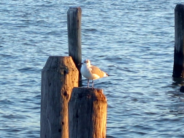
| Shame it's out of focus. The subject is too centred in the composition for my taste. The beak ideally needs to contrast with the background... here half of it is lost against a wooden post. The arrangement of the posts in the frame seems haphazard and not balanced. I do like the sunset colours on the side of the two foreground posts though. 4 |
|
|
|
10/28/2003 06:02:07 AM |
| Next time I think you should try a not-so-centered composition, because that can greatly improve a photo at times. |
|
|
|
10/27/2003 08:31:20 PM |
| This image would be much. much better if the seagul were in focus. Shallow focus would be even better. |
|
|
|
10/27/2003 02:20:34 PM |
|
|
|
10/27/2003 12:07:23 PM |
| Nice shot, but I'd like to see it sharper. |
|
|
|
10/27/2003 05:18:44 AM |
| Bird and poles need to be focused sharper. |
|
|
|
10/26/2003 08:16:55 PM |
| Little out of focus...great lighting though. |
|
|
|
10/26/2003 07:10:16 PM |
| Nice capture. I like the lighting on both the water and the pillars, gives a good contrast of warm and cool tones. Fits the challenge fairly well in the 'all alone' aspect, not sure I feel loneliness or solitude though. I think if the other pillar were cropped out it would give it a boost in that direct. I wish the seagull was more in focus/sharper. Nice composition and a good photo. Well done. 6 |
|
|
|
10/26/2003 12:37:35 AM |
| The bird is blurry which makes him hard to see. Cropping off the piling at the right edge would have given a stronger feeling of loneliness, as would shooting from a lower angle to get more of the open ocean (assume there weren't any boats or other birds). |
|
|
|
10/23/2003 09:32:03 PM |
| nice light from the sunset (?) ... a bit out of focus, and, for me, a bit too centralized. |
|
|
|
10/23/2003 03:21:06 PM |
| nice colors-a bit soft on the focus |
|
|
|
10/23/2003 01:45:54 PM |
| Pretty reflections off the piers and water. |
|
|
|
10/22/2003 10:50:50 PM |
| I like the idea, but I think the pillars in the background distract from the main subject. I also think some negative space on one side or the other would have given a greater sense of being alone. |
|
|
|
10/22/2003 04:21:18 PM |
|
|
|
10/22/2003 12:25:26 AM |
| haha :) I almost did the same thing. nice lighting at sunset? Composition would look better if he wasn't right in the center. |
|
Home -
Challenges -
Community -
League -
Photos -
Cameras -
Lenses -
Learn -
Help -
Terms of Use -
Privacy -
Top ^
DPChallenge, and website content and design, Copyright © 2001-2026 Challenging Technologies, LLC.
All digital photo copyrights belong to the photographers and may not be used without permission.
Current Server Time: 02/01/2026 08:53:50 AM EST.